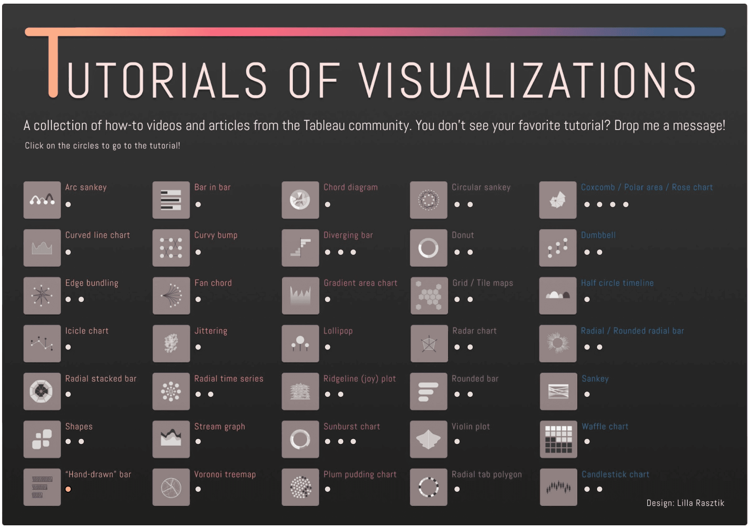
Check out this guide, by Lilla Rasztik (on Andy kriebel’s VizWiz page), showcasing a variety of unique charts but also including direct links to tutorials for each visualisation. It’s an excellent opportunity to sharpen your technical abilities and deepen your understanding of Tableau’s capabilities. By diving into these custom visualisations, you’ll enhance your creative problem-solving skills and gain insights into how different data representations can impact your storytelling.
Have you considered how these innovative charts might be utilised to convey complex data in a more engaging way? By clicking on the images, you can view each chart in action on Tableau Public, allowing you to see their potential firsthand. This resource is perfect for both beginners and experienced users looking to push their boundaries and innovate in their data presentations. Don’t miss this chance to elevate your Tableau expertise and inspire your next dashboard project!


