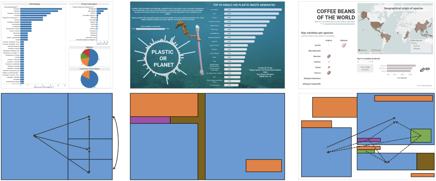
What makes the post especially useful is its practical tip on how to apply separate colour legends per measure – so a percentage-based metric doesn’t get washed out next to a currency measure — and how you can add a simple “measure selector” filter so end-users can toggle which measures to display.
TinyTableauTip – Measure Names and Values
Want to Get Latest Updates and Tips on Tableau Bites Blogs
Sign Up For Newsletter


