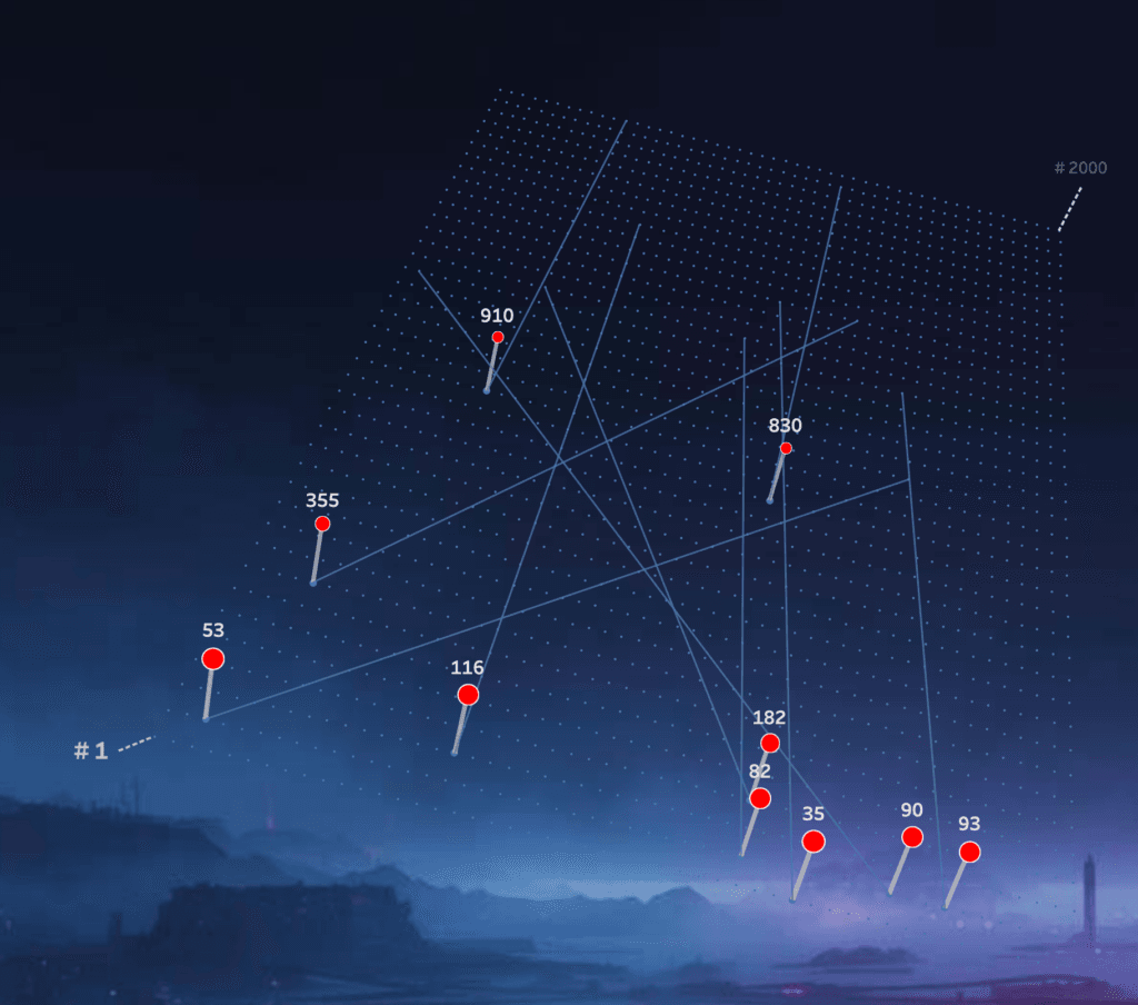
Johan de Groot’s piece offers both inspiration and practical insight. You’ll get a behind-the-scenes look at the trade-offs and creative decisions that went into building the visualisation, and links to explore the interactive dashboard yourself. It’s a great example of how familiar datasets , even a music chart, can become a playground for visual thinking and storytelling.
Top 2000 in Perspective – Behind the Scenes
Want to Get Latest Updates and Tips on Tableau Bites Blogs
Sign Up For Newsletter


