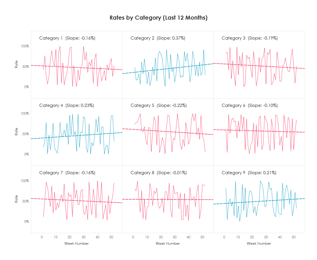
Unlock deeper insights into your data with Kevin Flerlage’s post – offering a detailed guide with a clear, step-by-step approach to understanding and calculating the slope of a trendline, a crucial technique for analysing trends and forecasting in your Tableau visualisations. Whether you’re analysing sales performance, monitoring business metrics, or exploring data patterns, mastering the calculation of trendline slopes will enhance your ability to interpret and leverage data effectively. The post is designed to be accessible to users of all levels, making complex concepts easy to grasp and apply to your own projects.
In addition to providing practical instructions, Kevin also delves into the significance of trendline slopes and how they can inform your data-driven decisions. By learning how to accurately calculate and interpret these slopes, you can make more informed predictions and draw meaningful conclusions from your data. Read on today and start incorporating trendline slopes into your data storytelling for more impactful visualisations.


