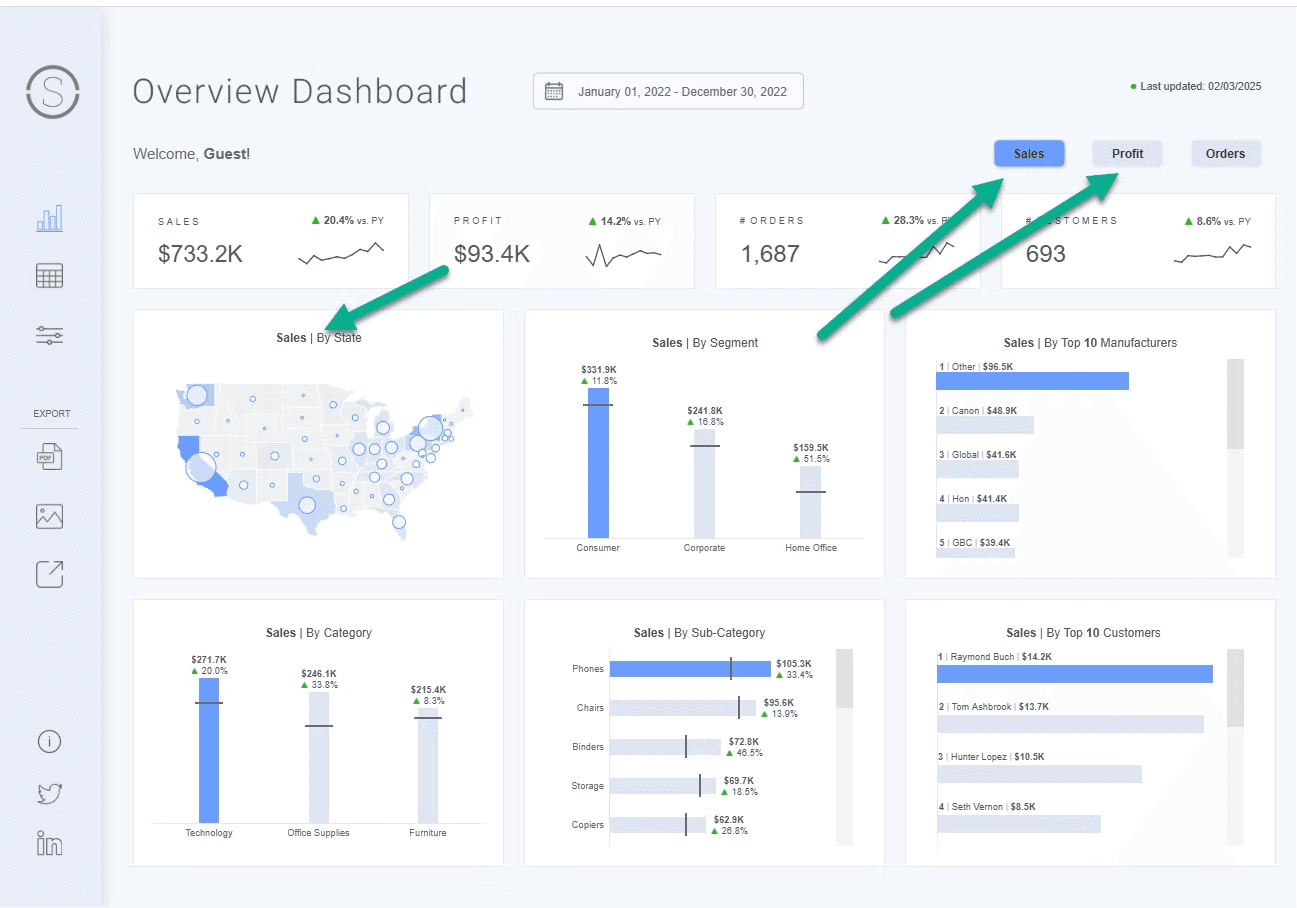
Dawn Harrington’s post reveals how to use KPIs as filters, allowing users to dynamically explore data with a single click. Instead of navigating through traditional dropdowns or filters, this method enables quick and seamless data exploration, making dashboards more engaging and efficient.
Not only does this trick streamline dashboard navigation, but it also adds a sleek, modern touch to your visualisations. By using KPIs as interactive elements, you can make data storytelling more effective, guiding users toward meaningful insights with minimal effort. Whether designing for executives, analysts, or casual users, this approach ensures that your dashboards remain intuitive and action-driven.


