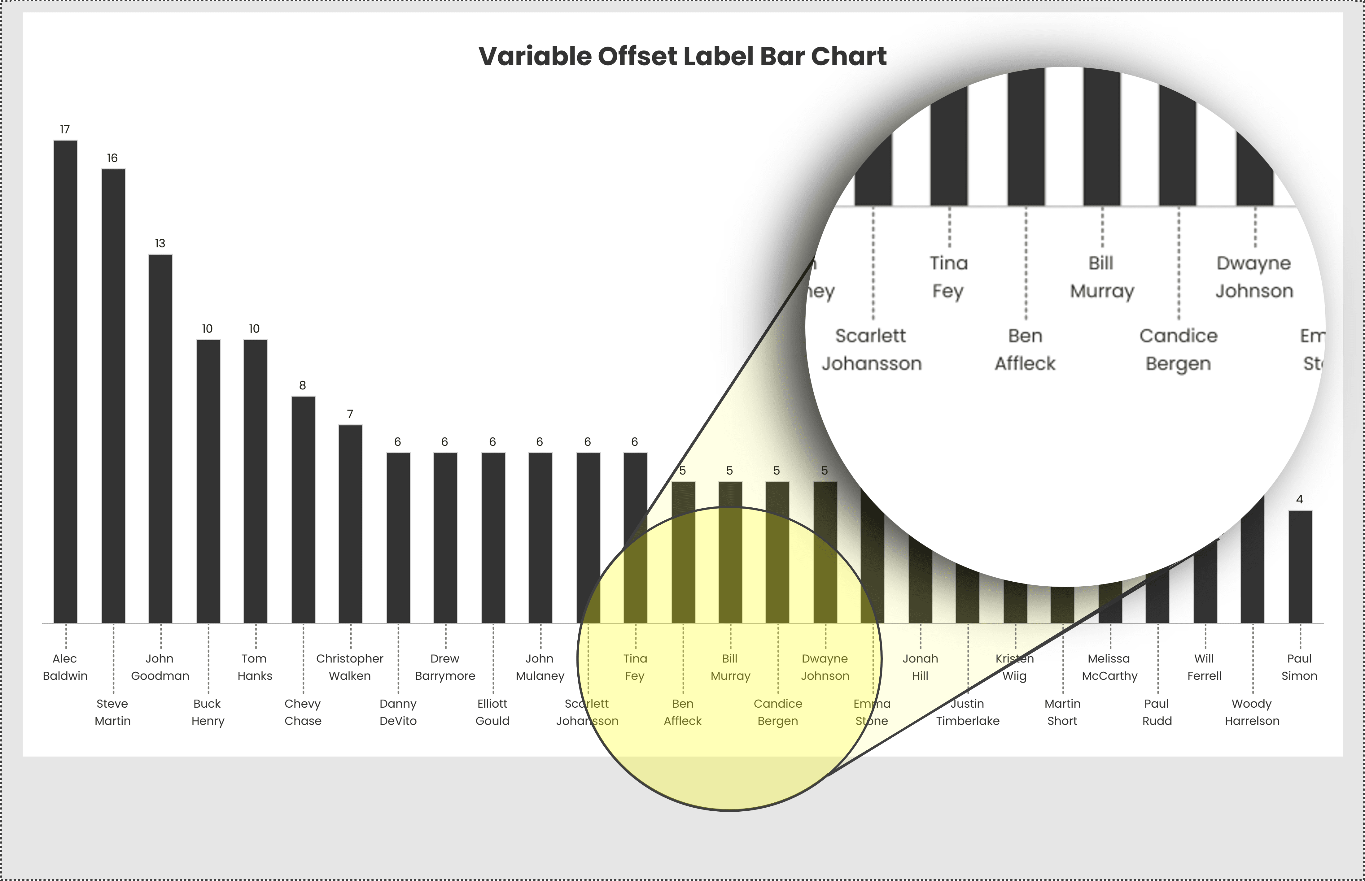
Clear and effective labelling can make or break a data visualisation – Kevin Flerlage’s post offers a smart solution! If you’ve ever struggled with overlapping labels or misaligned text in bar charts, his guide walks you through an innovative approach to improving readability. With step-by-step instructions, you’ll learn how to dynamically position labels so they remain clear and easy to interpret, no matter the data distribution.
Enhancing your Tableau dashboards with precise labelling techniques can greatly improve user experience and data storytelling. Kevin’s article is packed with tips that will help you create cleaner, more polished bar charts that communicate insights effortlessly – providing valuable strategies to refine your visualisations.


