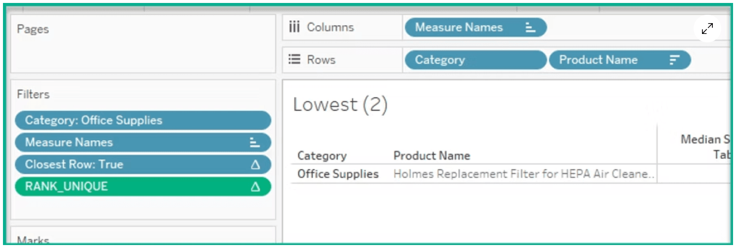
Dawn Harrington’s tutorial bridges theory and practice: it doesn’t just tell you what to do, it shows why those calculations work, and when you might need to tweak them (for example when two values tie near the median). If you build visualisations that need to highlight key benchmarks, this article will help you move beyond “top N” and “bottom N”, and toward making the “middle ground” meaningful. Read it, try it, and your dashboards will feel more polished and informative.
What are the Highest, Lowest and Median Products?
Want to Get Latest Updates and Tips on Tableau Bites Blogs
Sign Up For Newsletter


