Steve Wexler’s post blends practical advice with real visualisation examples, so you can see exactly what works, and why. The techniques here will help you choose visuals that communicate meaning, not just metrics. If you want your next survey dashboard to be something people understand, trust, and act on, this deep dive into what good really looks like is well worth your time.
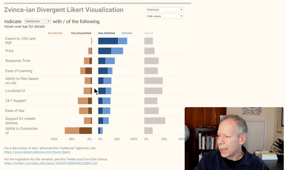

Tableau Training on
Tap Fast Track

Tableau Advanced Analyst

Tableau
Foundation

