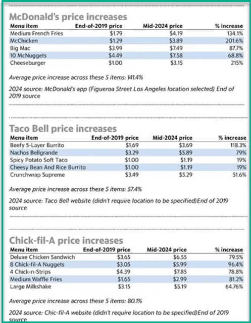
If you want to clearly communicate price increases in your dashboards, this article from Dawn Harrington’s guide explores the best visualisation techniques – from bar charts with reference lines to enclosed dot plots and scatter plots. Each method is designed to make your data more engaging and insightful, ensuring that stakeholders can grasp key takeaways at a glance.
By learning how to choose the right chart type and enhance your visual design, you can transform a basic report into a compelling, easy-to-interpret dashboard. Whether working in finance, retail, or any industry dealing with pricing analysis, these tips will help you present information in a way that drives better decision-making.


