Beyond the design mechanics, Fabio Murgia’s post grapples with the messy realities of real-world data – like inconsistent segment proportions – and wrestles with how best to make meaningful comparisons while staying intuitive. By placing AlphaR as the de facto axis, this invites readers to consider how chart design can elevate clarity, and why sometimes, a familiar but limited format (like the traditional stacked bar) remains the most accessible choice…
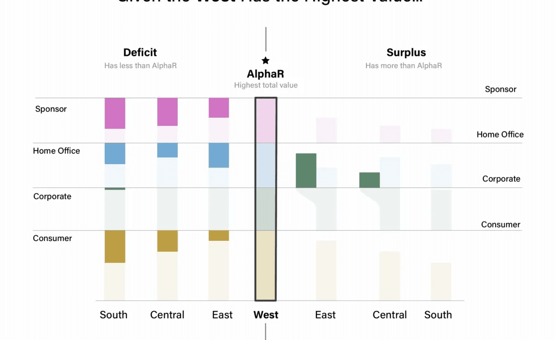

Tableau Training on
Tap Fast Track

Tableau Advanced Analyst

Tableau
Foundation

