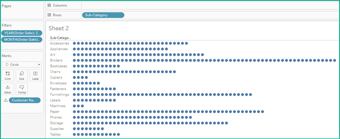
Dawn Harrington’s post uncovers the many advantages of dot strip plots, which are powerful tools for displaying data distributions and revealing underlying patterns in a clear and concise manner. She breaks down the mechanics of creating these plots and explains their effectiveness in comparing categories – making it easier to draw meaningful conclusions from complex datasets. By exploring this article, you’ll enrich your data visualisation skills.
This post encourages you to think critically about your choice of visualisation techniques. While bar and line charts are common, dot strip plots can offer a fresh perspective on your data – enhancing the clarity and impact of your presentations. If you’re ready to expand your toolkit and learn how to effectively communicate your data insights, this article is packed with valuable information that can inspire and inform your next visualisation endeavour.


