Dive into the art of data visualisation with Andy Kriebel and Damola Ladipo. For anyone looking to refine their skills in selecting the most appropriate charts for presenting data effectively, this chart guide breaks it down – equipping you with the tools to enhance your visual storytelling capabilities. By understanding the strengths and limitations of different charts, you’ll be able to communicate complex information more clearly and engage your audience with impactful visualisations.
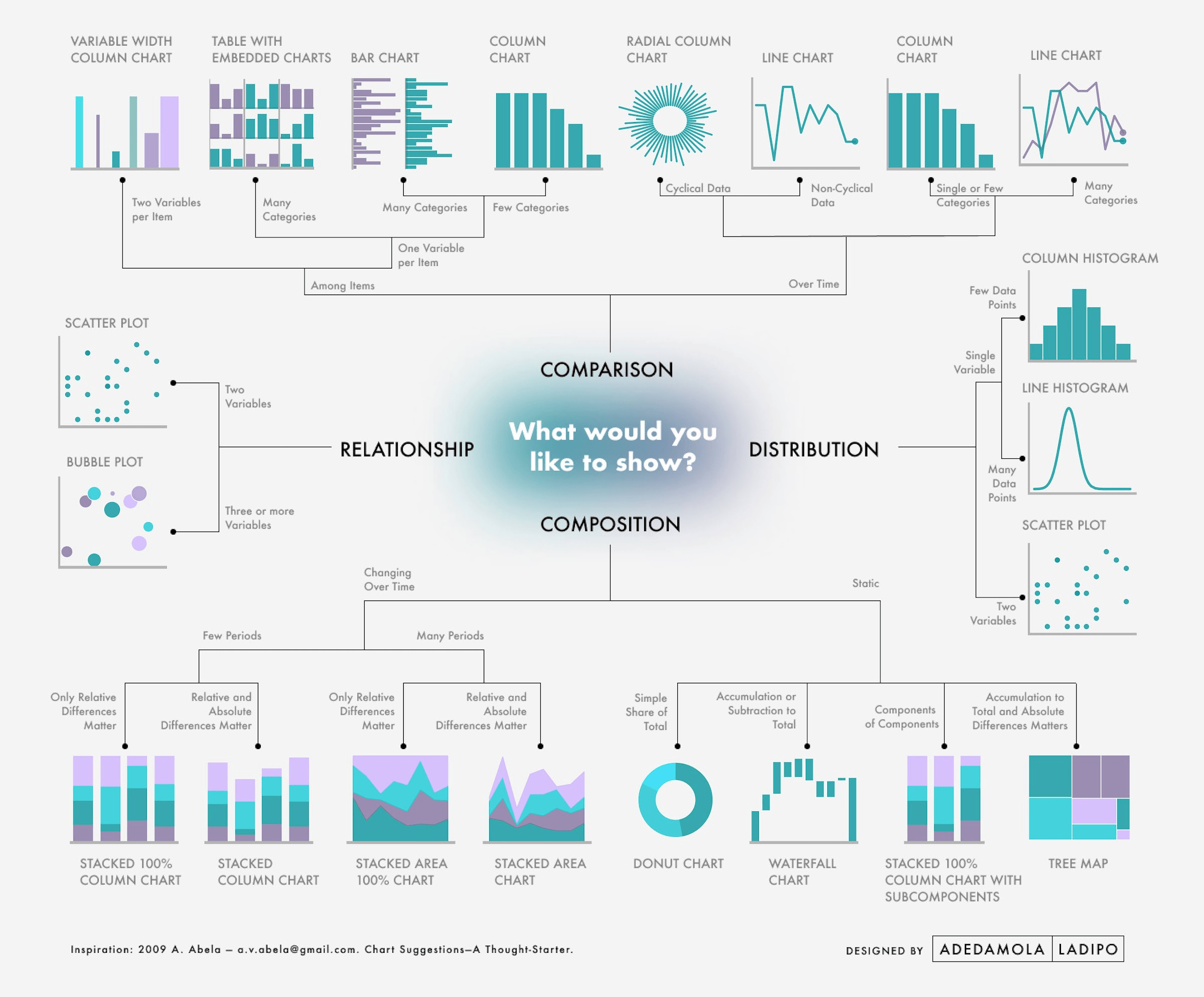

Tableau Training on
Tap Fast Track

Tableau Advanced Analyst

Tableau
Foundation

