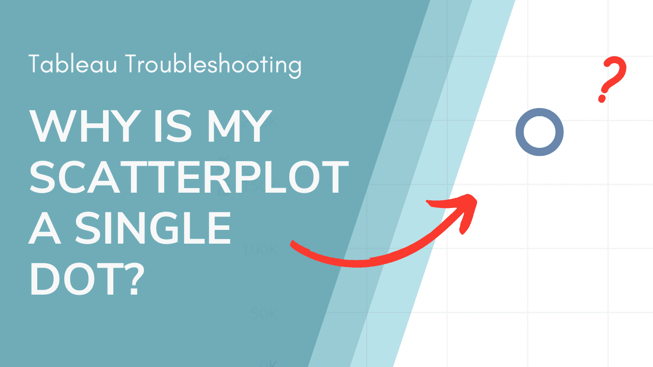
Creating a scatterplot in Tableau should help you visualise relationships between variables, but what if your chart ends up as just a single point? Ann Pregler walks us through why this happens and how to fix it, covering common pitfalls like data aggregation, incorrect field placements, and missing dimensions. Her troubleshooting tips will help you quickly diagnose and resolve the problem.
Instead of wasting time trying to figure out what went wrong, let this guide show you step-by-step solutions to get your visualisations working properly. Understanding these core Tableau principles will improve your overall data skills and help you create more effective, insightful charts.


