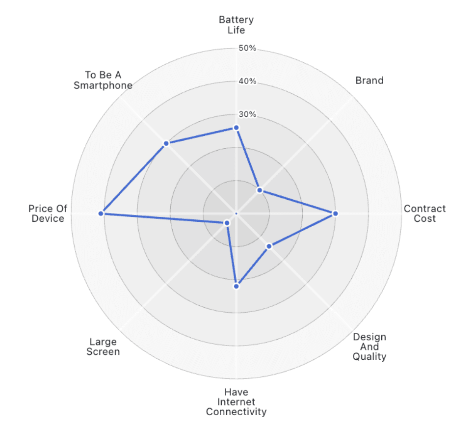
What makes Robert Kosaro’s piece especially valuable is that it doesn’t just criticise; it provides better alternatives, offer side-by-side comparisons and interactive examples that show how simple chart types like bar charts or dot plots often convey the same information more clearly and honestly. Change how you think about visualising multivariate data by reading on today!
Why you should avoid radar charts in data visualization
Want to Get Latest Updates and Tips on Tableau Bites Blogs
Sign Up For Newsletter


