Let’s face it – there’s a reason dashboards still get exported to Excel.
It’s not because users love spreadsheets.
It’s because they’re not yet confident navigating your dashboard.
They don’t trust what they’re seeing – or worse, they don’t know what to do with it.
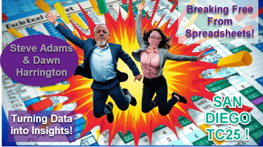
At Tableau Conference 2025, Dawn Harrington and I unpacked one of the most frustrating realities in data:
Most dashboards fail not because the data’s wrong, but because the user can’t see the next step.
👉 Maybe the actions aren’t clear.
👉 Maybe the design feels unfamiliar or overwhelming.
👉 Maybe it just doesn’t feel safe to make a call based on what’s on screen.
In our 40-minute session – now available to watch on Salesforce+ – we shared practical ways to change that.
What we covered:
- Why “Can I get this in Excel?” is a symptom, not the problem
- How to design dashboards that guide users to action, not leave them second-guessing
- The real reasons change is hard (and how to make Tableau feel less scary)
- Why trust, familiarity, and a clear story arc make all the difference
- The three pillars of visual analytics that keep users coming back (not clicking ‘Export’)
📊 If your dashboards aren’t helping people feel confident enough to act, you’re not alone.
But there’s a better way.

(And while you’re there, check out 80+ other top talks from #TC25.)
This article was featured in Tableau’s Weekly Roundup.


