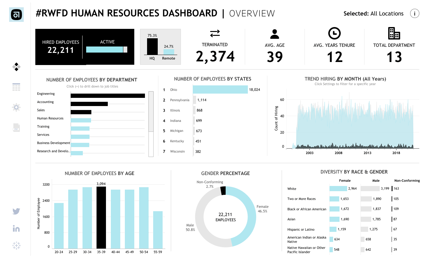
This post by Kate VanDerAa offers a fascinating glimpse into the innovative creations of the Tableau community, highlighting the most beloved and impactful visualisations. From mesmerising dashboards that uncover hidden patterns to interactive maps that transport you across continents, each visualisation featured in this post tells a compelling story and showcases the boundless potential of data-driven communication. Immerse yourself in the rich tapestry of visual narratives presented in this post. Whether you’re seeking inspiration for your own projects or simply eager to marvel at the ingenuity of fellow data storytellers, this post offers insights and ideas. With its diverse range of topics and styles, from data journalism to personal analytics, there’s something for everyone to enjoy and learn from.
8 Most-Favorited Data Visualizations on Tableau Public
Want to Get Latest Updates and Tips on Tableau Bites Blogs
Sign Up For Newsletter


