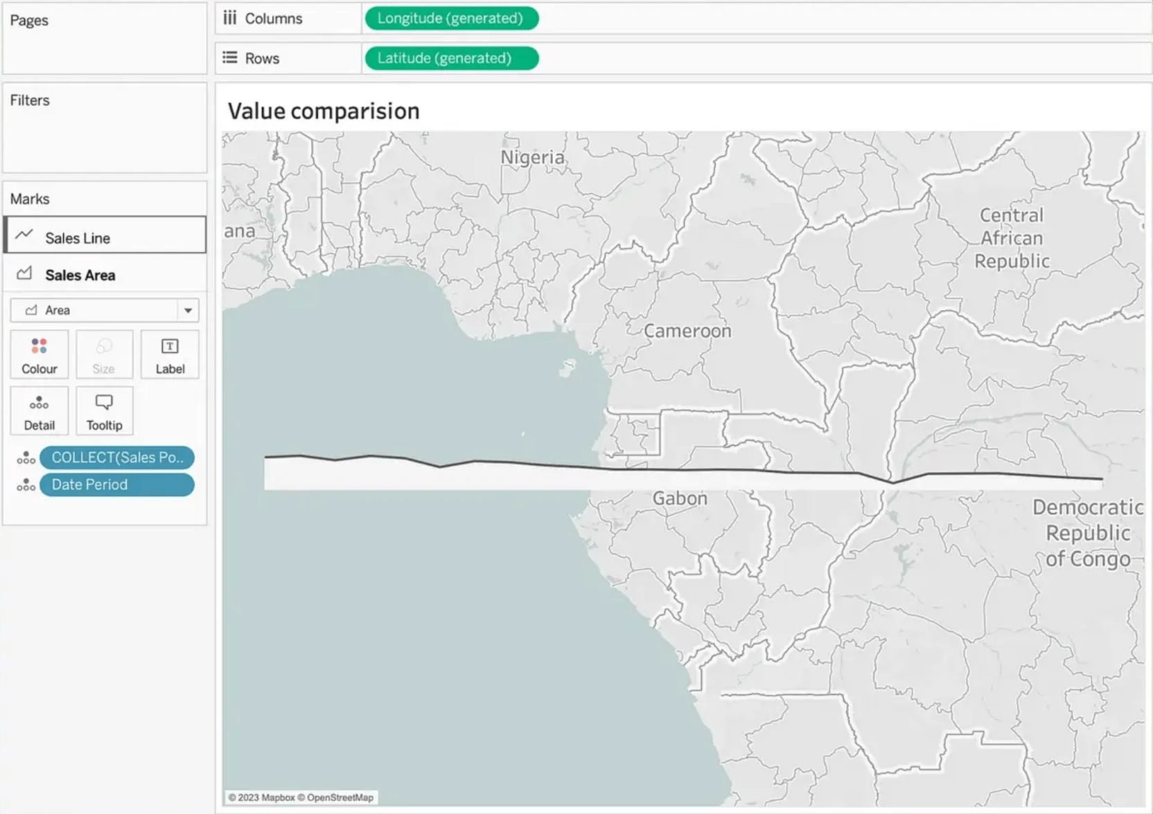
Are you eager to level-up your skills in data visualisation? Ivett Kovács walks us through, including creating geographical data points using MAKEPOINT() and other advanced techniques. You’ll discover how to develop a visualisation within a map in Tableau, normalise values, and even make use of the magic map layer option. By diving into this post, you’ll not only enhance your data storytelling skills, but also gain valuable insights from an industry expert. Don’t miss out on this opportunity to transform your data visualisation game!
Dynamic Line Comparison in Tableau
Want to Get Latest Updates and Tips on Tableau Bites Blogs
Sign Up For Newsletter


