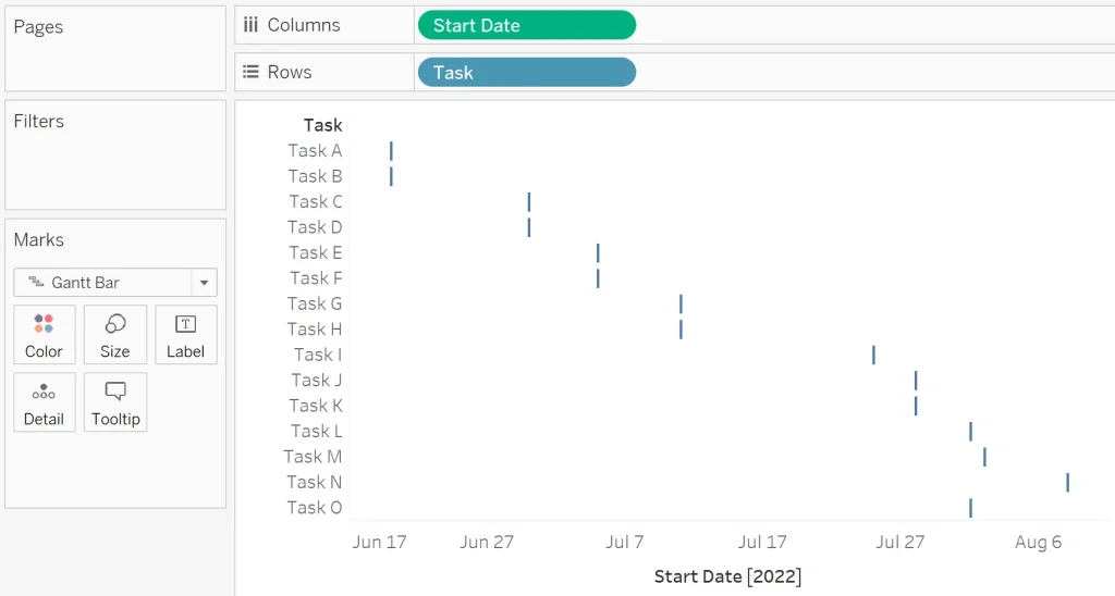
3 Ways to Make Gorgeous Gantt charts in Tableau
“By the end of this post, you’ll be able to make rounded Gantt charts, show today’s date as a dynamic reference line, and colour the Gantt marks by their status”…
“By the end of this post, you’ll be able to make rounded Gantt charts, show today’s date as a dynamic reference line, and colour the Gantt marks by their status”…

A post by Andy Kriebel talking us though how to use a set action to drill down into the underlying data behind a mark. Read Original Article…
How to Show and Hide Underlying Data with a Set Action Read More »
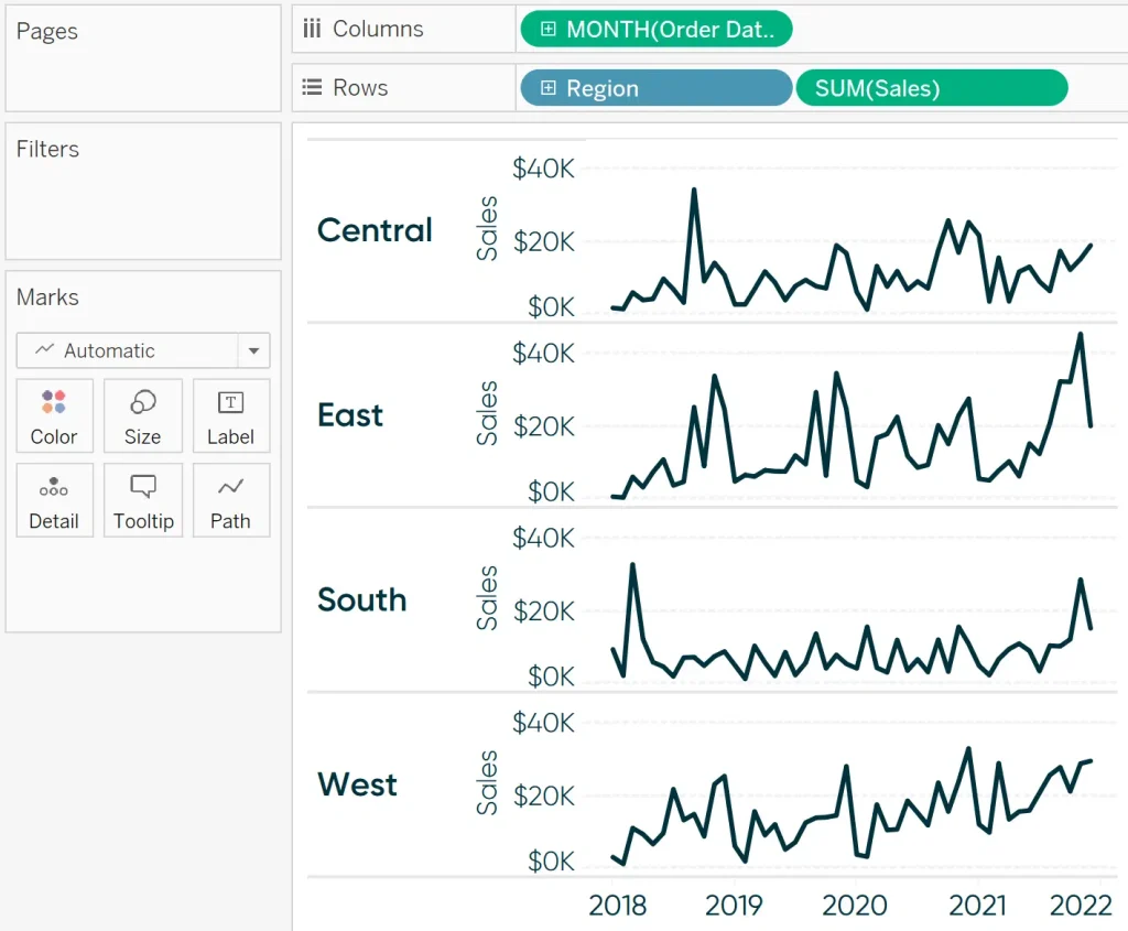
“By the end of this post, you will be able to color each row (or column) in a chart based on whether the most recent performance was positive or negative”
How to Color Entire Tableau Charts Based on Latest Performance Read More »
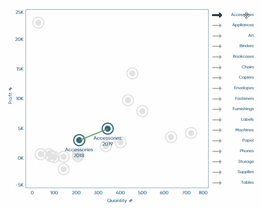
Maggy Muellner shows us how to create a dual-axis scatter plot that compares a single selected dimension member to a previous time period. She also shares some helpful design tips…
Tableau Hack: How to Dyeamically Highlight Selections in Connected Scatter Plots Read More »
Lindsay Betzendahl tells us in this blog post “This may not come as a surprise, but I love enhancing client Tableau dashboards with simple effects that make someone’s experience a
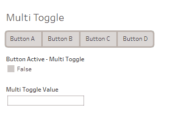
This guide, by James Zirbes, talks through steps to create beautiful and functional buttons in Tableau for a variety of needs Read Original Article…
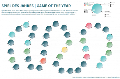
“I finally created a viz inspired by one of my all time data viz heroes… and I finally got to use the new map layers in Tableau.” Lisa Rapp tells
Here a team of data leaders from the world’s greatest data community to share their top 10 principles of business analytics… Read Original Article…
Here a team of data leaders from the world’s greatest data community to share their top 10 principles of business analytics… Read Original Article…

Looking for an alternative way to trigger conditional alerts in Tableau? Andrew Watson shows us how we can use Tableau Subscriptions to build an alternative type of alert. Read Original
