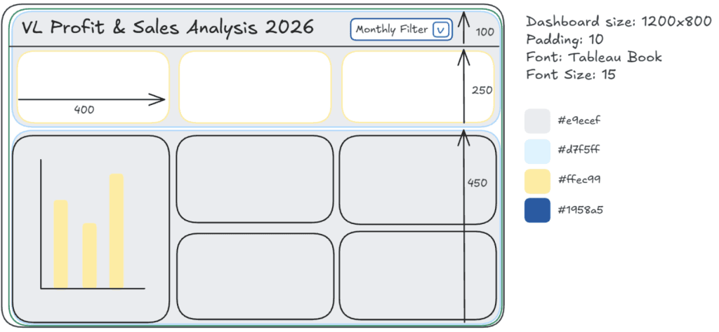
Sketching a Story – Planning Data
Whether you’re trying to communicate with a client, define the layout and interaction of a dashboard, or simply organise your own thoughts, Vivien Lee’s approach will help you save time…
Whether you’re trying to communicate with a client, define the layout and interaction of a dashboard, or simply organise your own thoughts, Vivien Lee’s approach will help you save time…

Rather than just presenting abstract syntax, Tyler Green shows you how LOD expressions solve common problems and explains why they work the way they do. Mastering LOD expressions opens up

Gurdip Sodhi argues that councils should shift from treating data as an extraordinary achievement to making it habitual muscle memory – consistently influencing daily, weekly, and strategic decisions regardless of
Making It Stick: Why Council Data Must Move from Heroic to Habitual Read More »

Here are hands-on and immediately usable techniques. Whether you’re building dashboards for internal users, refining interactions, or just trying to sharpen your toolkit, these tips include both subtle interface tricks
Ten Tips & Techniques (Round 9) – Analytics, Data Visualization, and Tableau Read More »
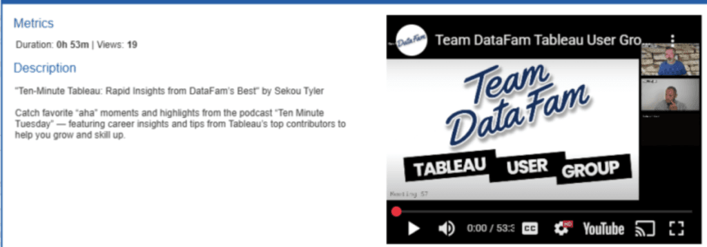
You’ll come away confident in enhancing your dashboards with multimedia, while also thinking creatively about how video can support understanding and engagement in your analytics work. If you’re looking to
What makes this especially worth your time is that user group talks are structured around actual user needs – not abstract theory. You’ll likely see how real analysts think about
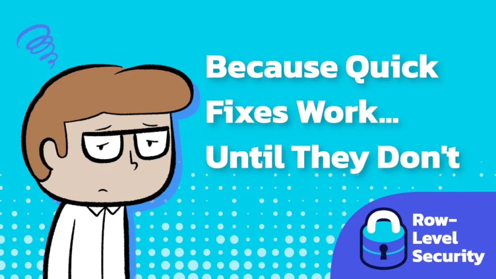
Tanner Ladd balances real-world constraints with actionable techniques. You’ll learn why the “DIY” approach to RLS is popular and where its limitations begin to show as your user base grows
Why Row-Level Security in Tableau Matters (Part 2) Read More »
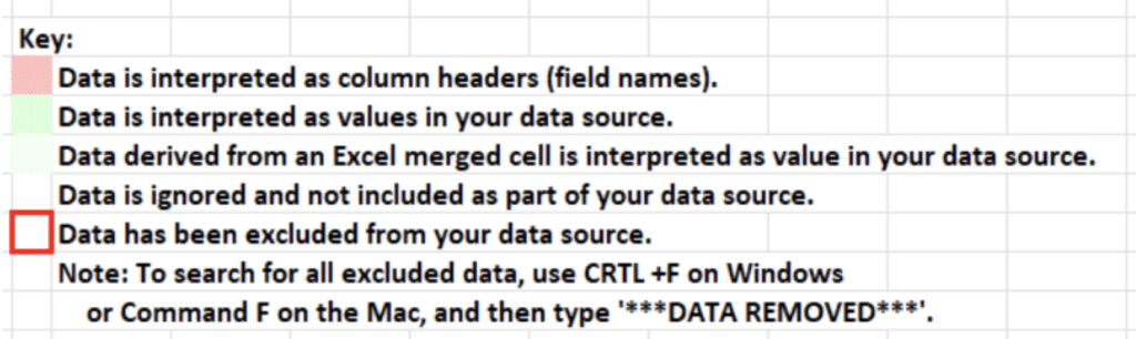
Durkka Rajasegaram walks you through when and why you’d want to use the Data Interpreter, and even gives tips on verifying the results to make sure the automated cleaning didn’t
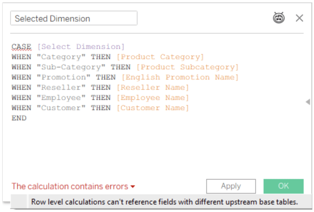
For anyone who’s ever built analytical models that go beyond a simple star schema and wondered why dimension switching works differently across base tables, Dan Chissick’s post gives clarity and

What makes Rashi Desai’s article especially timely is how it connects modern analytics with human behaviour and ethical design. Traditional BI and machine learning often focus on metrics and automation,
Why Human-Centered Data Analytics Matters More Than Ever Read More »
