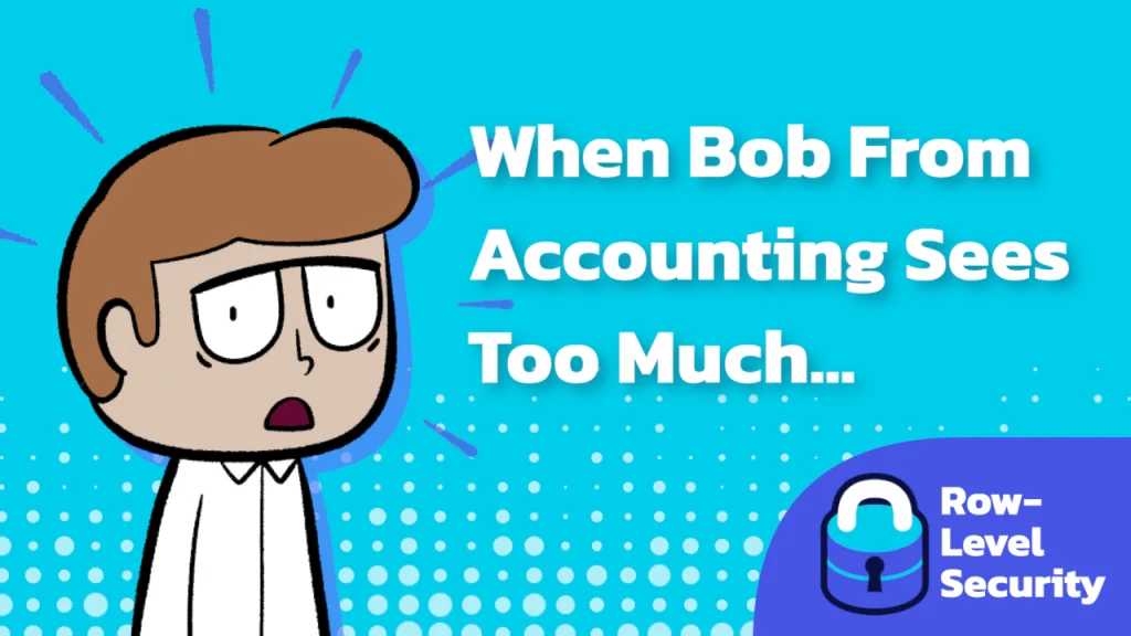
Managing Dashboard Date Filters
This post by Robert Rotzin doesn’t just stop at theory, it offers real, practical guidance. You’ll find actionable tips on implementing this blend of fixed presets and drag-and-drop flexibility. It’s…
Jonathan Schwabish’s post balances accessibility with design ambition. It acknowledges the risks of using colour-coded text – especially for readers with visual impairments, but emphasises that this method works powerfully
What makes Kevin Flerlage’s piece even more valuable is its focus on delivering clarity without sacrificing context. You’ll learn a performant technique to isolate and emphasise a particular series –
A truly valuable guide for is its hands-on clarity. Donna Coles takes you step-by-step, from setting the geographic role and adjusting filter settings to creating parameters and linking them directly
Cheryl Lin’s post tackles mindset too. Imposter syndrome, perfectionism, and outdated norms can hold back even the most talented individuals. By encouraging women to internalise their value, embrace small victories,
5 Ways to Accelerate Women’s Leadership in Data Cultures Read More »
Johan de Groot’s post takes it up a notch with a cleaner, word-aware abbreviation method to intelligently preserve full words while trimming the rest, so your text doesn’t feel jagged
As a consultant, Dan Chissick the relies on rapid, precise access to calculated fields when troubleshooting dashboards with clients – or better yet, avoiding documentation and clicking around aimlessly. This
But it’s not just about the trick – it’s about doing it elegantly. Kim Tricker guides you step by step while avoiding common pitfalls. She even shares handy hacks from
Conditional Formatting for a Single Measure Value in Tableau Read More »
Tharashasank Davurulu’s article isn’t just about style – it’s about strategy. It highlights how well-placed BANs can clarify context, reinforce brand messaging, and elevate user understanding. if you’re looking to
Big-Ass Numbers (BANs): Why They Belong on Every Dashboard Read More »
Ever wrestled with a dashboard that needs a dozen-plus colors for different people—and ends up looking like a rainbow gone rogue? Nicole Klassen tackles this chaos by creatively using white