
Top 2000 in Perspective – Behind the Scenes
Johan de Groot’s piece offers both inspiration and practical insight. You’ll get a behind-the-scenes look at the trade-offs and creative decisions that went into building the visualisation, and links to…
Johan de Groot’s piece offers both inspiration and practical insight. You’ll get a behind-the-scenes look at the trade-offs and creative decisions that went into building the visualisation, and links to…
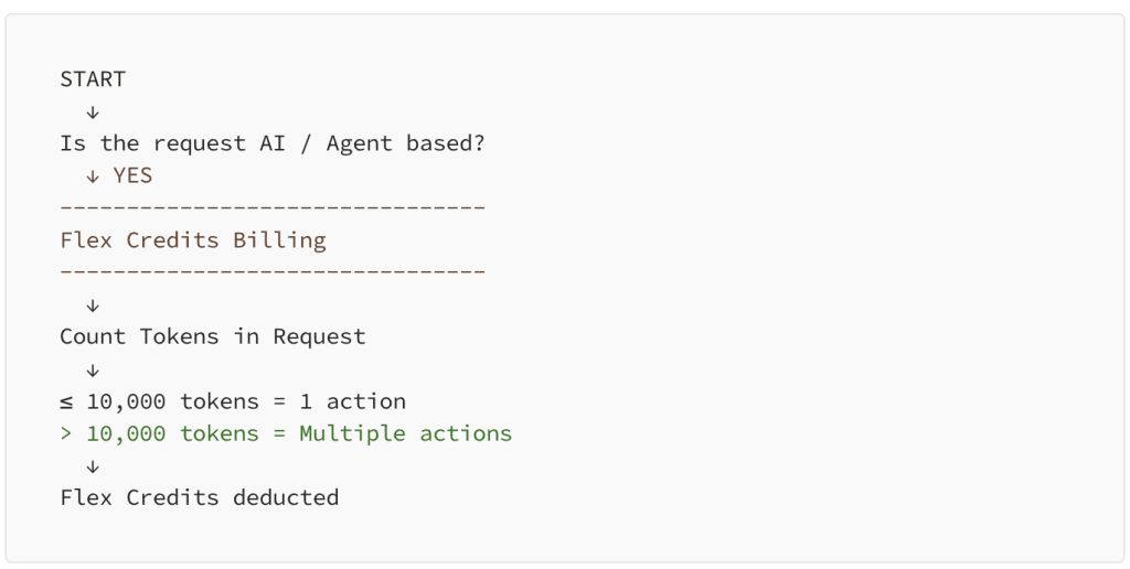
Instead of just hyping new functionality, Tarun Gupta breaks down the financial implications with thoughtful context, real examples, and strategic considerations that are relevant to teams of all sizes. If
Tableau Next Tips #3 : Understanding the Cost Behind Tableau Next Features Read More »

Mariia Sapsai’s tutorial bridges the gap between design and practical execution. You’ll not only learn how to create a spiral chart, but also why and when to use it, helping
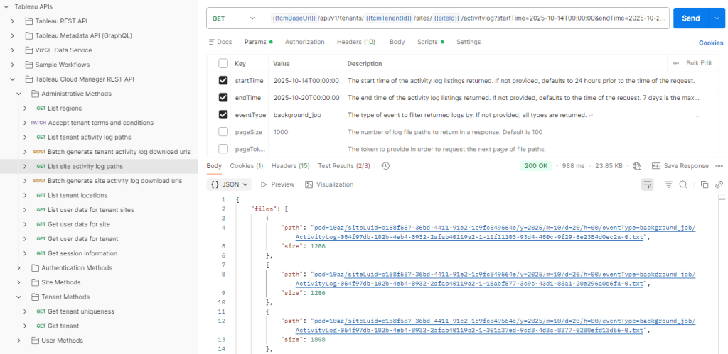
Matt Coles’ article not only explains why this capability matters but also highlights how it works, who can benefit from it, and what to expect next as the API evolves.
Monitor Tableau Cloud Deployments of Any Size with the Platform Data API Read More »

Be informed with Joe Constantino and Will Sutton and this informative post! Read now!
Run AI on Your Tableau Server or Cloud with Tableau MCP Read More »

Dan Chissick’s article is an honest, community-driven perspective. Instead of a generic recap, he shares candid reflections on networking with peers and Tableau ambassadors, memorable sessions, and even the little
Through a candid account of migrating from Excel and SharePoint to Tableau, Chris McClennan and Karan Gupta shares the practical realities of modernising finance reporting, including performance challenges, data inconsistencies,

Each skill is explained in context, with an eye toward how it influences impact, collaboration, and decision-making in complex projects. Piero Paialunga doesn’t just tell you what matters, but helps
6 Technical Skills That Make You a Senior Data Scientist Read More »
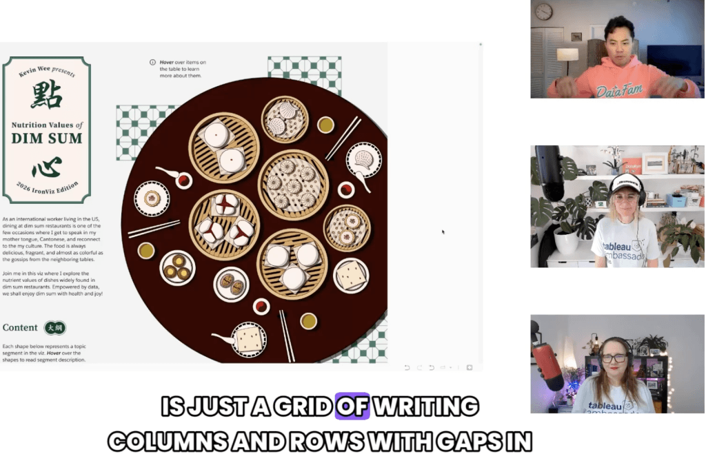
Whether you’re a seasoned data visualisation professional or just starting your journey, this conversation, with Kevin Wee, Ann Pregler, Heather Cox, and Kimly Scott, will spark fresh ideas, sharpen your
D28 Tableau IronViz Secrets: Storytelling, Colour Theory and Cultural Connections Read More »
What makes Francesca Plaskett’s post especially useful is the practical, hands-on approach: you follow each action in Tableau and end up with a chart that adapts based on user selection,
