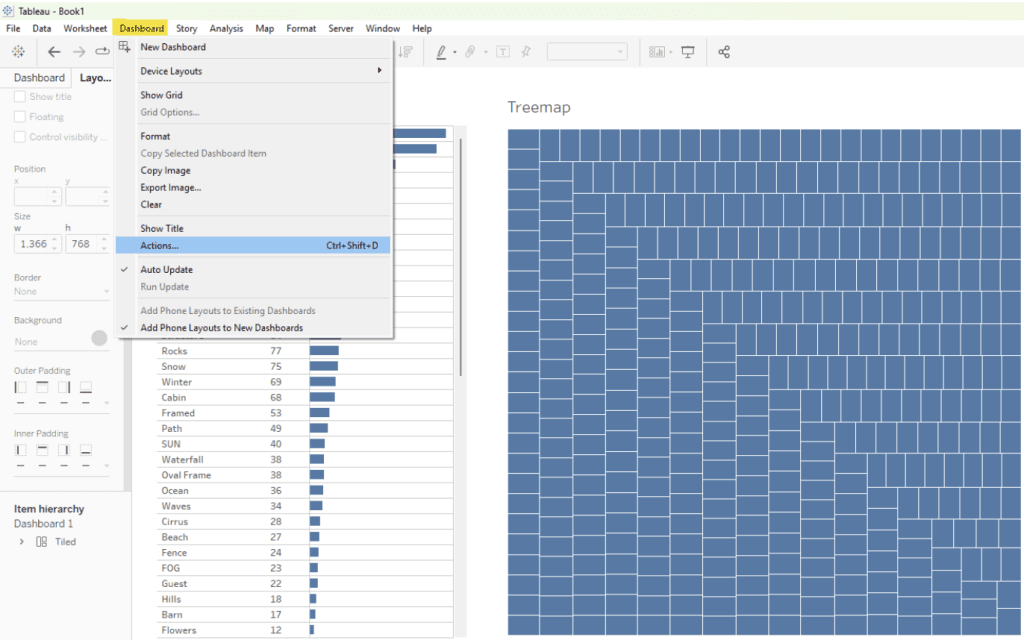
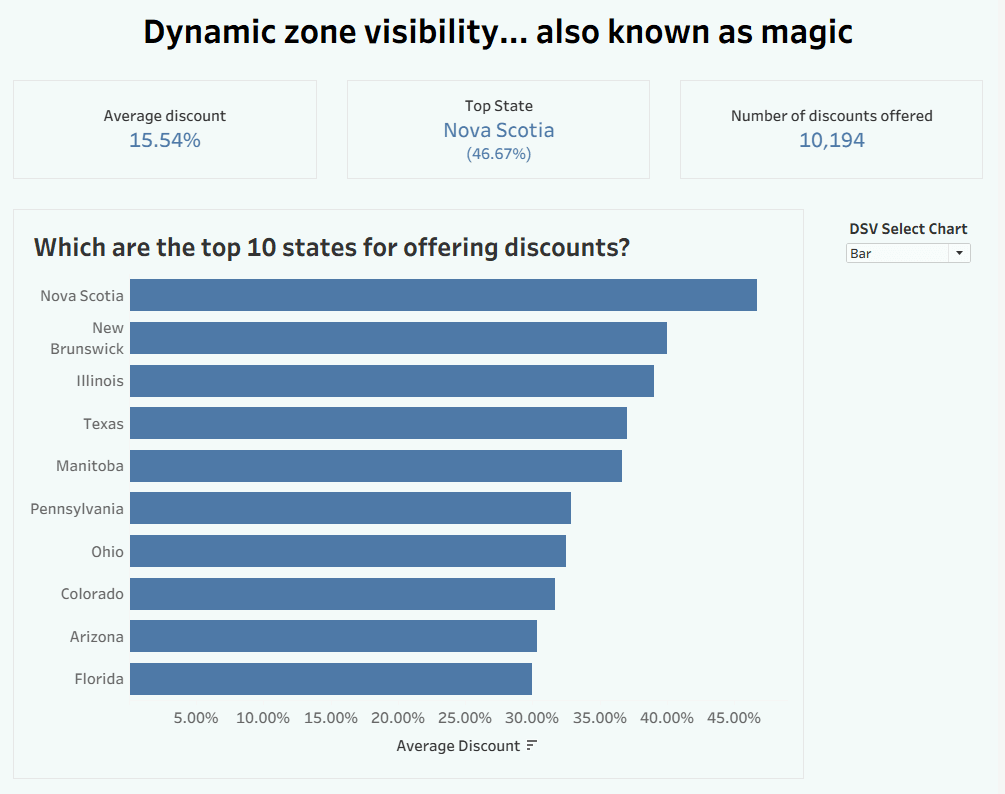
Show/Hide – but better
What makes Johan de Groot’s guide especially practical is its focus on usability. Learn how to use transparent buttons, layout containers, and thoughtful formatting to control visibility without overwhelming users.…
With Katie Bueno, you’ll learn how to scaffold the sheet, align axes, and layer marks to create rich, multi‑chart tables that are easy to maintain and adapt. If you’ve ever
Create an Enhanced Tableau Table: Multi-Chart, One Worksheet Method Read More »
This article, by Edun Joshua is concise and practical, offering clear instructions – like specifying the correct colour palette types (categorical, sequential, or diverging) and refreshing Tableau to apply changes
How to create custom colour palettes in Tableau Desktop Read More »
Dawn Harrington‘s breakdown helps us find a smart solution when you want to highlight differences between someone’s performance and the average without clutter or confusion. If you’re aiming to improve
Chris Geatch shares clear explanations for building dynamic tables where columns can be reordered, formatted, and updated without breaking your visualisation . If you’ve ever been frustrated by static tables or
Oliver Linley shows how to set up the buttons, wire them to parameter actions, and make your dashboards feel as natural as browsing a website. Whether you want to highlight
Build Custom Parameter Selection Buttons in Tableau Read More »
Elizabeth Archer’s practical walkthrough is what makes this article useful. She shows how to exclude specific worksheets (like a ‘Targets’ sheet) using the Filter by Worksheet Name function, making your
Dashboards aren’t just built. They’re delivered. Imagine ordering something online and hearing nothing for ten days. No order confirmation. No tracking updates. No expected delivery date. Then, out of the
The Prime Dashboard Delivery Process: Why Perception is the Key to Stakeholder Trust Read More »
Why the dashboards that divide opinion often drive real change… If your dashboard gets applause from everyone, it might not help anyone When a dashboard earns polite applause, vague praise,
Its combination of theory and practical solution-building is what makes Johan de Groot’s post so useful. He explains why responsive labels matter and shares a reusable method using dual axes