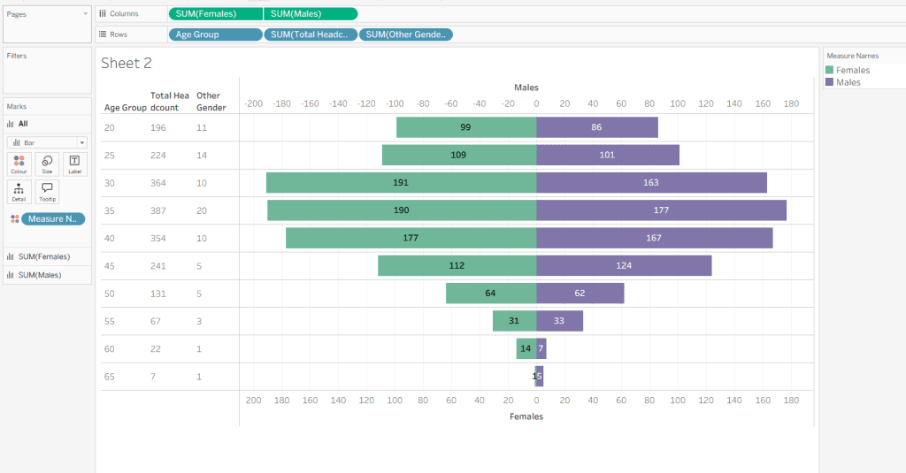
Population Pyramids
Even if you’re not a demographer, Donna Coles offers insights that apply to data-visualisation, analytics and planning. You’ll get ideas on how to interpret age and gender distributions, spot trends…
Even if you’re not a demographer, Donna Coles offers insights that apply to data-visualisation, analytics and planning. You’ll get ideas on how to interpret age and gender distributions, spot trends…

Robin Jones‘ piece is especially valuable in that it doesn’t just highlight what you can do with parameters, but how and why you should. He explores design decisions around user
From Static to Dynamic: How to Supercharge Your Tableau Dashboard with Parameters Read More »

This isn’t just theoretical, Leopold Ringmayr’s guide dives into the setup steps – like running the Tableau MCP server, connecting a client LLM such as Claude Code, and then leveraging
Connecting LLMs to Tableau: A Practical Guide for Using Tableau MCP Read More »
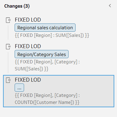
Beyond the what and how of LODs, Francesca Plaskett’s article encourages a mindset shift: treating your data prep as a place to do more than clean and filter, but also

What makes this article a must-read, is the mindset it cultivates: intentional design, ethical storytelling and user-centred thinking. For example, Joshua Smith emphasises the need to think about ethics and
How to Create a Compelling Iron Viz Qualifier Entry in 10 Steps Read More »
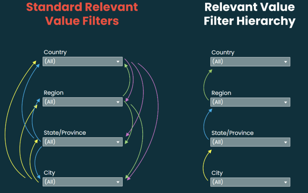
Kevin Flerlage (of The Flerlage Twins) offers practical reflection on how data can reconnect with genuine impact – encouraging you to question your own use of “relevance” and “value” in
Don’t Get Caught in the Relevant Value Filter Trap Read More »
Alyssa Huff’s article offers insights into how to use these principles as part of your workflow: when to evaluate your interface, how the heuristics complement (but don’t replace) user testing,
How Jakob Nielsen’s Usability Heuristics Apply to Visual Analytics Read More »

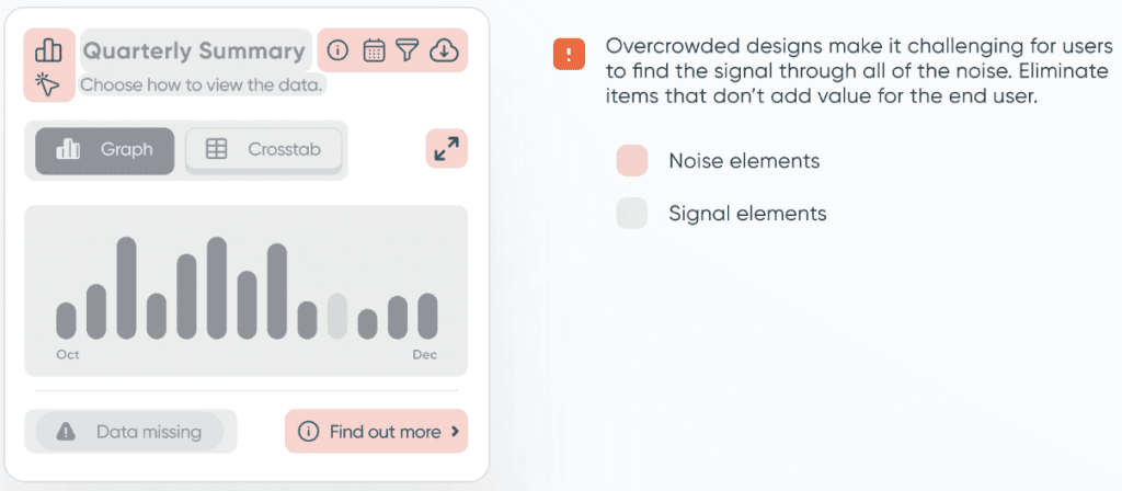
This week, Eric Balash moves on to the next layer of polish: Padding and Whitespace. These may seem like small design choices, but getting them right can instantly elevate your
Dashboard Design Lab: Week 2 – Padding and Whitespace Read More »
Beyond the immediate technical how-to, Joseph Hughes‘ post is a great reminder of how small tweaks can make big differences in how users can interact with their dashboards. Learn how
Beyond the mechanics of chart types, Cole Nussbaumer Knaflic invites you to step back and ask: What does my data story need to show? Are you comparing categories at one
