The Anatomy of a Great Business Dashboards
A practical post from Jennifer Dawes. Learn tips like asking “why” repeatedly to clarify what the dashboard is actually for, choosing metrics that drive action (not just fill space), and…
A practical post from Jennifer Dawes. Learn tips like asking “why” repeatedly to clarify what the dashboard is actually for, choosing metrics that drive action (not just fill space), and…
Yes, it’s possible, and, simpler than you might think. In this informative video by Andy Kriebel, there will be exact calculations you can copy, a clear step-by-step setup guide and
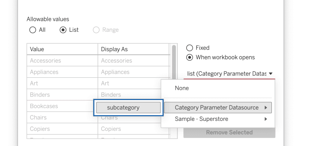
How to Add Two Values to One Parameter in Tableau Read More »
This isn’t just about aesthetics. Bennett Frohock gives practical, hands‑on advice: how to set workbook spacing, how to use the “Always show grid” option, how containers interact, and how to
This piece combines the technical and the personal. Alongside the feature‑comparison, Dan Chissick shares his journey – first encountering Tableau, getting hooked, and seeing what it enables in real projects.
Every step is illustrated, and David Gandary addresses subtleties like how reference lines aggregate and why you need a “fixed LOD” to prevent multiplying values by mark count. If you
It’s a practical and flexible approach. You don’t just get a one‑trick solution, you get patterns you can adapt (hierarchies, custom groupings, “All”, etc.). If you’ve ever felt constrained by
Add ‘All’ and more options to a Dynamic Parameter Read More »
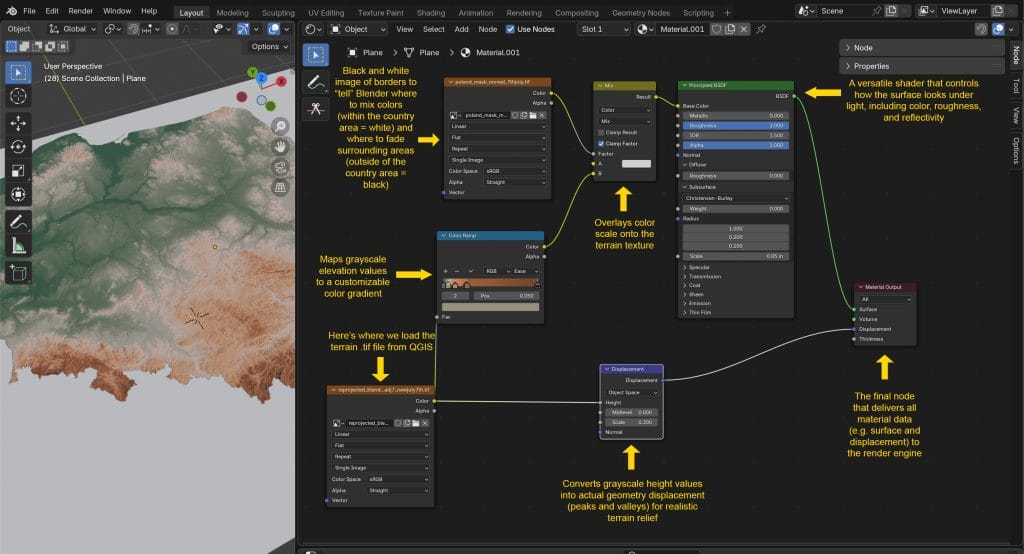
This amazing post by Ken Flerlage, featuring Kasia Gąsiewska-Holc takes you behind the scenes, sharing struggles, choices, and tradeoffs (lighting, projection alignment, image exports, toggles in Tableau). Whether you’re a
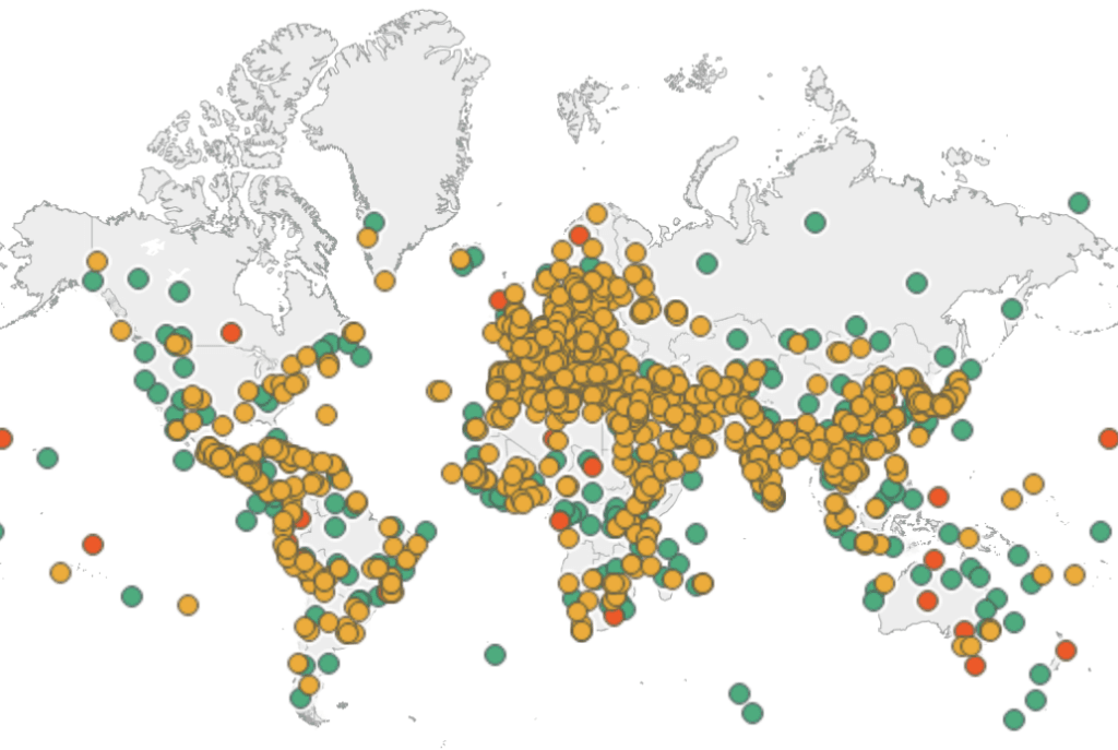
Beyond the visual appeal, Yusuke Nakanishi’s dashboard is also a powerful learning tool. It gives you context: site ages, categories, and geographies, helping you see patterns (for instance, clusters in
You get a clear sense of when AI helps speed things up (for example, generating column logic or handling text splits) and when it can trip you up. Robert Rouse
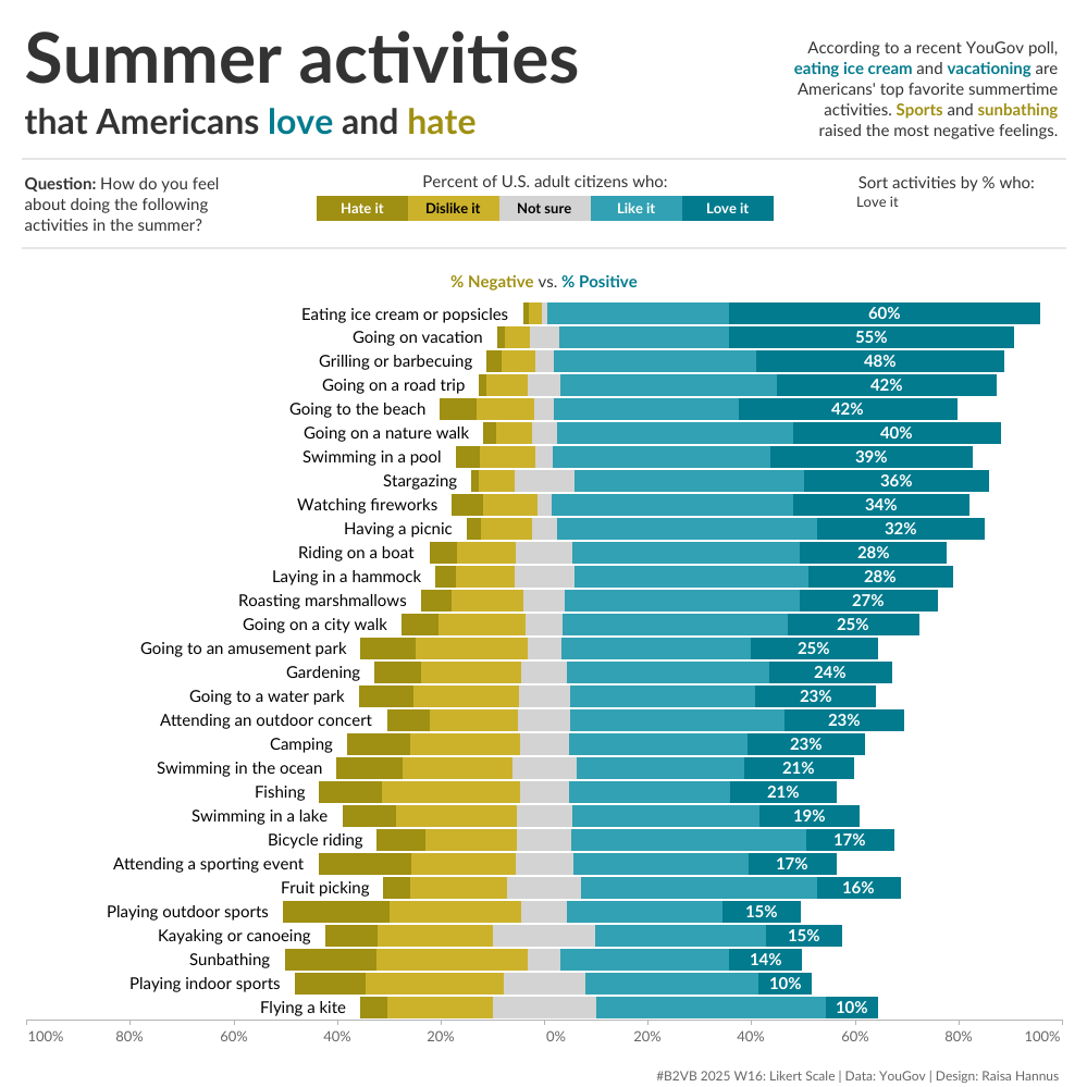
What’s more, this is a great chance to sharpen your visualisation muscles. Eric Balash’s post gives you the actual dataset (from a YouGov survey of over a thousand people) to
