A better way to connect the dots
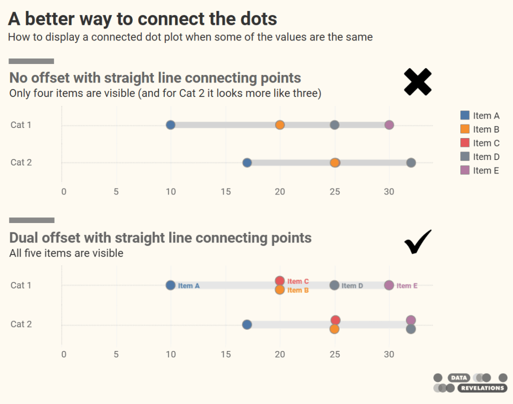
Steve Wexler reveals a subtle (yet impactful) design enhancement: ditching the legend entirely. By using direct labelling on only the first row’s dots and cleverly enabling “Always show” labels via…
Steve Wexler reveals a subtle (yet impactful) design enhancement: ditching the legend entirely. By using direct labelling on only the first row’s dots and cleverly enabling “Always show” labels via…

What stands out in Sarah Pallett’s story is the shift from practice to purpose. By consistently engaging with structured community challenges, she learned through doing, and built a body of
From Practice to Purpose: How Tableau Community Projects Accelerated My Career Read More »
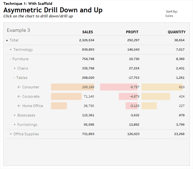
The real standout, though, is the scaffolding technique that powers this interactivity. Rosario Gauna walks you through how to construct both explicit scaffolding, using an auxiliary table to define hierarchical
Asymmetric Drill Down Using Scaffolding Technique Read More »
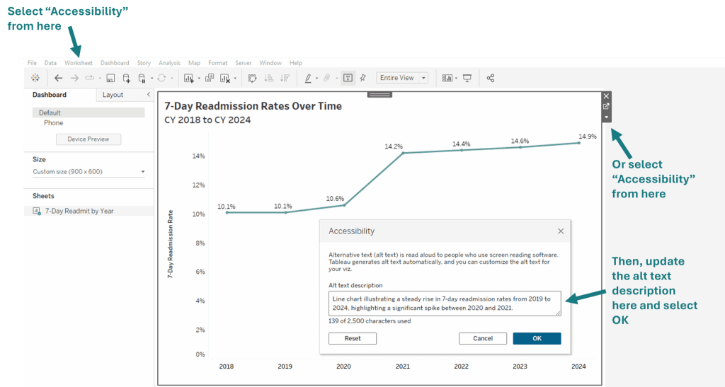
Stephanie Shorey-Roca highlights the power of keyboard accessibility enhancements added in Tableau 2024.3 and 2025.1. With Viz Navigation, users can explore marks using arrow keys and interact with dashboards without
Accessible by Design: Making Data Visualization More Inclusive with Tableau Read More »

What sets this article apart is the practical angle – and the small tricks that make a big difference. Ethan Hahn shares tips that go beyond theory, offering strategies that
Measure Names & Values Overview with Some Tips & Tricks Read More »
What makes this capability truly transformative is how it bridges Tableau’s trusted data layer with the flexibility of external tools. Whether you want to embed live KPI numbers into a
The Tableau VizQL Data Service: What It Is, What It Can Do, and When to Use It Read More »
Sam Batchelor also offers a bonus tip on customising calculation names. By adding a dash (“–”) in front of the calculation name, you can ensure it appears first on the

Beyond its user-friendly interface, the article provides a comprehensive guide on setting up Tableau Pulse, from configuring site settings to integrating with communication platforms. It also addresses governance considerations, ensuring
Beyond the design mechanics, Fabio Murgia’s post grapples with the messy realities of real-world data – like inconsistent segment proportions – and wrestles with how best to make meaningful comparisons
What Makes the Difference in a Stacked Bar Chart? Read More »
Whether you’re a savvy Tableau pro or just starting out, this post is a good read. Ken Flerlage’s post strikes the perfect balance between visionary features and practical utility —
Four Cool New Features in Tableau 2025.2: Part 2 Read More »
