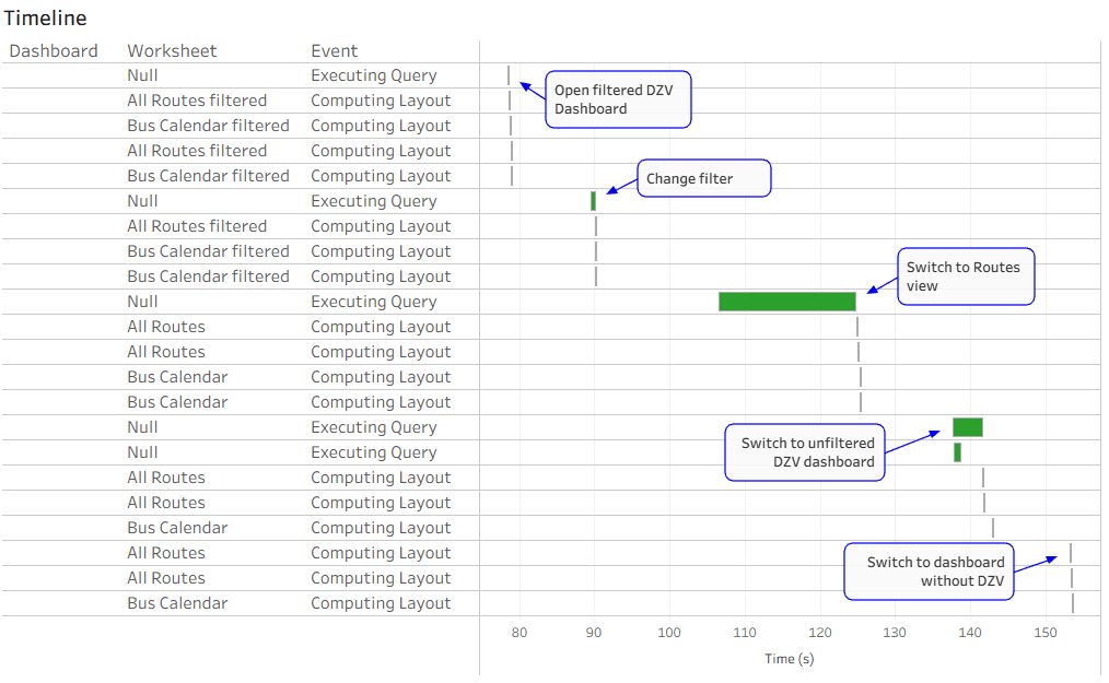
DZV is great, but…
Here is a balanced perspective. It doesn’t demonise DZV, instead, Dan Chissick introduces a smart workaround to ensure that hidden worksheets aren’t just invisible, but their data is also filtered…
Here is a balanced perspective. It doesn’t demonise DZV, instead, Dan Chissick introduces a smart workaround to ensure that hidden worksheets aren’t just invisible, but their data is also filtered…
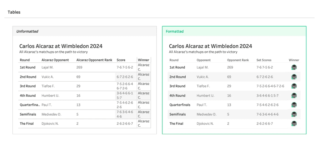
The tips don’t stop at tables – Kim Tricker’s article spreads its design wisdom across line graphs and bar charts too, offering nuanced advice that balances form and function. If

Tharashasank Davuluru’s article helps you understand how storytelling through thoughtful visualisation can enhance user confidence and ensure that sensitive information is presented with integrity. For anyone working in BI, analytics,
Visualizing Trust: How to Tell the Story of Data Privacy Through Dashboards Read More »

Gear up to learn from real-world examples, including case studies that bring the creative process to life. Whether you’re crafting dashboards for analysis or aesthetic impact, Jacob Rothemund’s article invites
Breaking the Blank Canvas – Finding Inspiration for Visualisation Projects Read More »

If you’ve been on a long drive with a dodgy sat-nav, you already know what it’s like to learn Tableau. You follow the route, you’re sure you’re nearly there –
Learning Tableau Forever (and Never Quite Being an Expert) Read More »

In Eric Parker’s step-by-step YouTube video, you can see the technique in action and implement it yourself with confidence. It’s a practical, performance-first strategy that will benefit anyone who works
How to Add Input Filters in Tableau Prep (Improve Performance!) Read More »
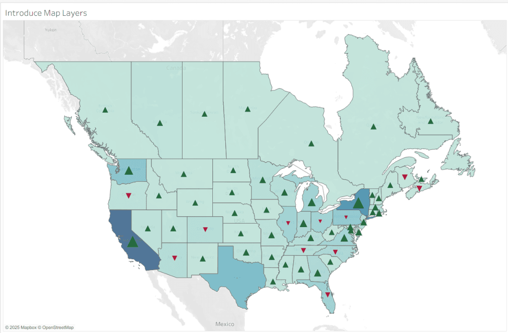
Jim Dehner showcases practical examples that let you apply solutions directly within Tableau. From simple sales maps and layered map techniques to dynamic colour-range maps and point or choropleth mapping
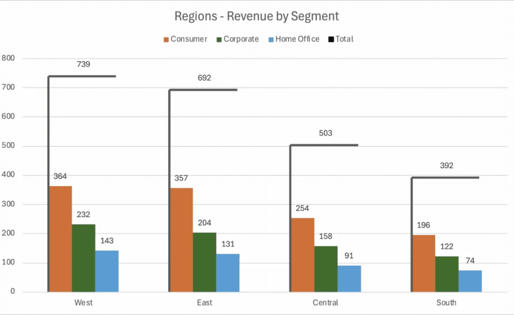
Jonathan Schwabish acknowledges that stacked bars remain deeply familiar to audiences and sometimes familiarity wins. Their key insight? In several experimentations, those new designs felt disconnected or confusing, especially when
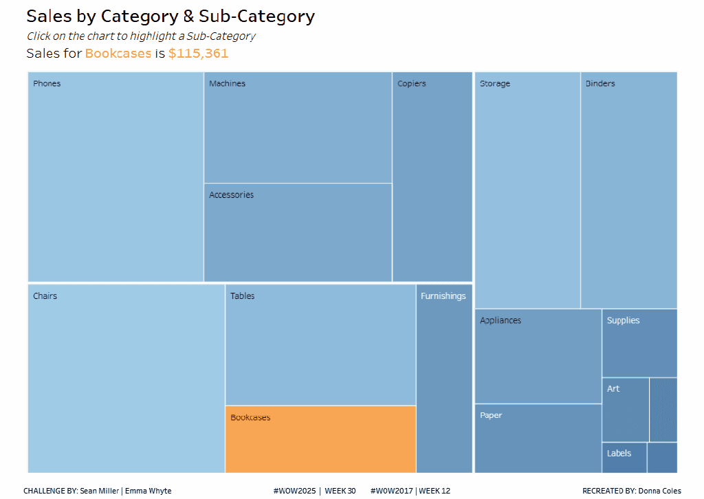
Donna Coles takes you step-by-step, from setting up a pSubcat parameter and creating the Is Selected Sub Cat calculation, to configuring marks, colours, and formatting with finesse. Then she adds
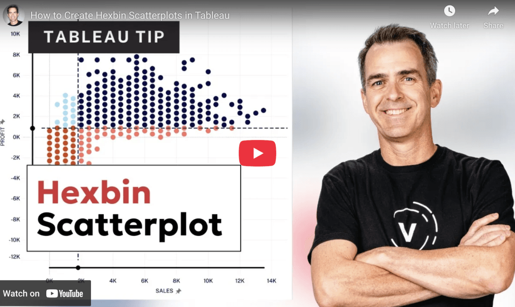
This isn’t just about aesthetics, it’s about deepening your data clarity. By replacing scattered marks with structured, colour-coded hexbins, you instantly improve interpretability and storytelling. Whether you’re exploring geographic distributions
