
How to Make a Pop-Up Warning Message in Tableau
What makes Eric Parker’s guide especially valuable is its practical approach: no need for external tools or extensions – everything is built right into Tableau. Learn how to create calculated…
What makes Eric Parker’s guide especially valuable is its practical approach: no need for external tools or extensions – everything is built right into Tableau. Learn how to create calculated…
What sets this article apart is its practical, experience-driven advice. Sarah Pallett doesn’t just tell you what to do, she shares why it matters and how to do it effectively.
Thinking About Tableau Cloud Migration? Lessons Learned from the Field Read More »
With Juan Carlos Guzman, you’ll learn everything from sourcing and sizing appropriate image files to integrating them seamlessly into your visuals, boosting both clarity and engagement. This visual enhancement can
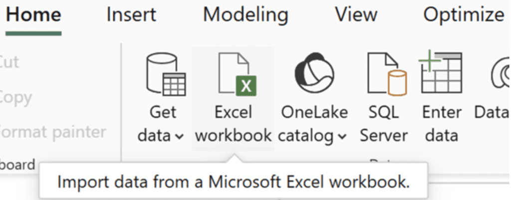
How to Insert Custom Images in Power BI Matrix Visuals Read More »

Robert Rouse’s article, touches on the practical implications: discussing guardrails in healthcare systems, fairness in algorithmic design, and preparing for a future where AI takes over routine tasks. With real-world
My Takeaways from the 2025 Missional AI Conference Read More »
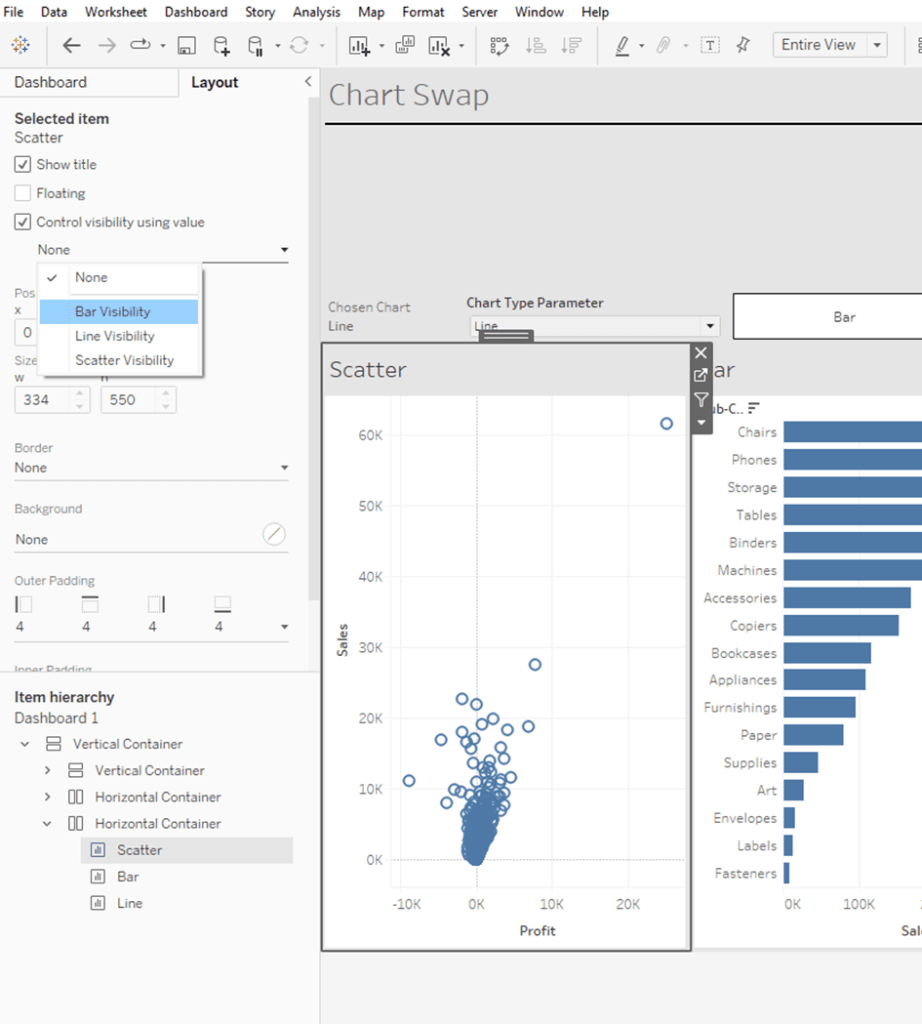
With Stella Sophie Bukowski’s clear, example-driven approach, you’ll see step-by-step instructions for setting up toggle buttons, configuring visibility settings, and creating a seamless experience that feels polished and professional. If
Dynamic Zone Visibility – How to Create Interactive Chart Switching in Tableau Read More »

Bennett Frohock walks you through seamless navigation flows, explains how filters stay in sync across pages, and even shows how users can append data without leaving the app – all
Transforming a Dashboard to a Decision App with Sigma Read More »

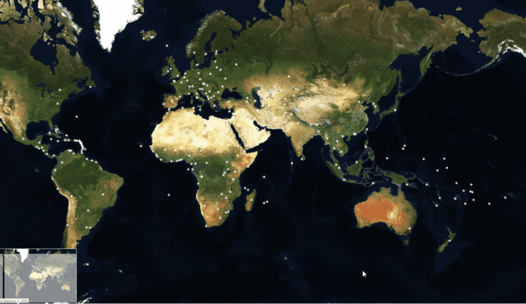
What makes Brittany Rosenau’s piece even more fun is its interactive community angle. Brittany includes not just the step counts, but extra fields like miles, country, device type, and even
Visualize Tableau Conference: Results of the Tableau Conference 2025 Step Tracker Read More »

What really sets Mat Hughes‘ article apart is its sharp focus on architecture and long-term fit. Instead of simply choosing a vendor based on popularity, he urges readers to consider
The 2025 Gartner Magic Quadrant: What They Got Right (and What’s Next) Read More »
Whether you’re embedding visual insights into presentations or building interactive, map-rich dashboards, this post offers with Ken Flerlage offers practical, hands-on examples to help you level up your workflow. Don’t
Four Cool New Features in Tableau 2025.2: Part 1 Read More »
But this post isn’t just a tutorial – it’s a masterclass in problem-solving and design thinking. Donna Coles guides you through the choices she made. Whether you’re a beginner or
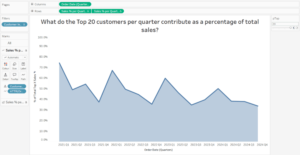
Can you create this seemingly simple line chart? Read More »
