
The Dashboard Crash Test
How to prevent your dashboard from quietly sabotaging decisions Imagine this. You’ve designed a beautiful dashboard. The metrics are accurate. The filters work. The layout looks clean. But then…
How to prevent your dashboard from quietly sabotaging decisions Imagine this. You’ve designed a beautiful dashboard. The metrics are accurate. The filters work. The layout looks clean. But then…
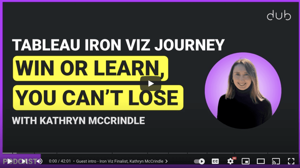
With Fee Gordon and Sarah Bernett, Kathryn McCrindle discusses her philosophy of treating every project as a “win or learn” opportunity – a mindset that champions experimentation, resilience, and continuous
Tableau Iron Viz Journey: Win or Learn, You Can’t Lose with Kathryn McCrindle Read More »
Tharashasank Davuluru’s piece dives into how newspapers use visual hierarchy and block-based organisation to communicate complex information clearly and attractively. These practices, enhanced by modern tools like CSS Grid online
What Newspapers Can Teach Us About Dashboard Design Read More »
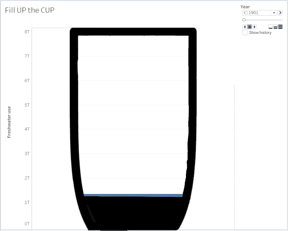
Here, Stephan Christner explains how to prepare an image with transparent fill, set up the underlying data (like Freshwater usage from Our World in Data), and turn on animation –
Vani Agarwal walks you through each step with clear snapshots and an easy-to-follow process, making it accessible even if you’ve never used placeholders or dual-axis layering before. If you’ve been
How to add dimensions after measures without converting measures into discrete values Read More »
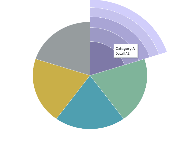
While coxcomb charts aren’t always suited for hard decision-making, they embrace their artistic charm – perfect for sparking discussions or highlighting patterns in a creative way. Lindsay Betzendahl shares both
Creating an Exploding Pie (Coxcomb) Chart in Tableau Read More »
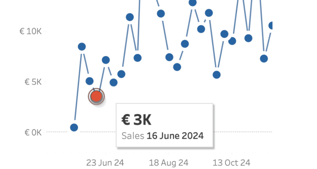
This technique is particularly useful during presentations or when sharing dashboards with users unfamiliar with Tableau’s interactivity. While there might be slight performance considerations on platforms like Tableau Public, the
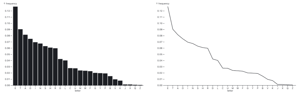
Great visualisation isn’t just about following rules – it’s about knowing when to bend them. Through clear examples, Robert Kosara demonstrates how bar charts maintain clarity and accuracy in such
When to use bar or line charts for time series data Read More »
Left alignment is more than just a design preference — it aligns with how people naturally read and process information. By following familiar reading patterns and maintaining visual consistency, left-aligned

Adam Mico‘s call to action is clear: while mastering Tableau Desktop remains valuable, it’s equally important to broaden your perspective and embrace the platform’s new capabilities. By understanding and leveraging
Beyond Dashboards: Why Tableau Next is an Invitation to Level Up Read More »
