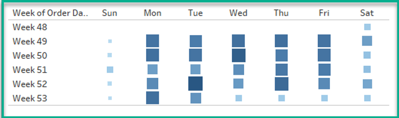
Highlight Table Hack
The post with Dawn Harrington introduces a simple yet powerful technique for making your highlight tables more engaging and easier to interpret. By using dynamic colour formatting and calculated fields,…
The post with Dawn Harrington introduces a simple yet powerful technique for making your highlight tables more engaging and easier to interpret. By using dynamic colour formatting and calculated fields,…

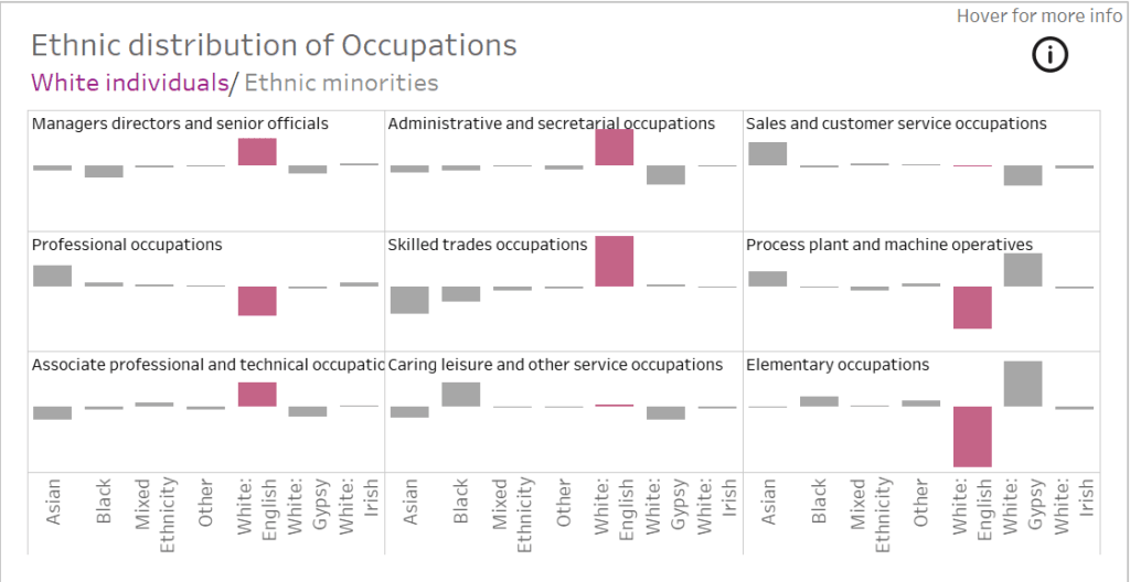
In this insightful article, with Robby White, he walks us through Tableau Viz Extensions are and how they allow you to go beyond standard charts and graphs. With these extensions,
If you’re working with trellis charts in Tableau, you know how powerful they can be for visualising multiple small multiples of data. However, adding clear and dynamic titles to these

In this tutorial from Andy Kriebel, you’ll learn how to build this unique chart type, which blends elements of bar charts and line graphs. Unlike traditional bar charts, L-shaped bars
L-Shaped Bars: The Chart You Didn’t Know You Needed Read More »
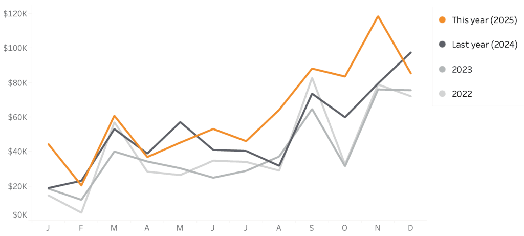
If you’re looking to enhance the clarity and impact of your line charts, this post by Johan de Groot is a worthwhile read!! Line charts are one of the most
Ethan Lang introduces this innovative visualisation technique that blends the power of Sankey charts with bump charts to showcase rankings and movements in a dynamic and clear way. Unlike traditional
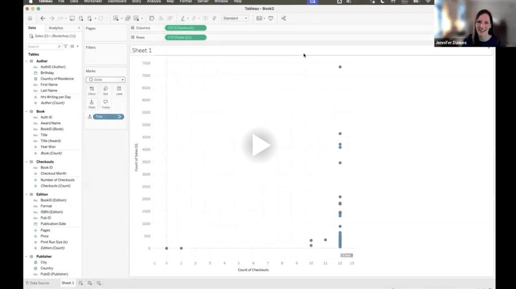
In this post, Kirk Munroe and Jennifer Dawes providing clarity on how this feature can simplify your data models, improve performance, and enhance the overall analytical experience. Whether you’re new
Tableau Relationships with Kirk Munroe and Jennifer Dawes Read More »

Robby White provides a thoughtful analysis of when and why to use each mode. While light mode has traditionally been the go-to choice for many dashboards, dark mode offers advantages
How to Decide Between Light Mode Versus Dark Mode Dashboards in Tableau Read More »
What makes Priya Kondola’s guide especially helpful is its clear explanation of how to set up your trellis chart from scratch and avoid common pitfalls. She highlights the importance of
Part 1: How To Create A Trellis Chart in Tableau Read More »
Dawn Harrington’s post simplifies a complex concept – making it accessible to users of all skill levels. Whether you’re visualising sales performance, website traffic, or project timelines, sparklines can make
