Level Up: Custom Legends in Tableau
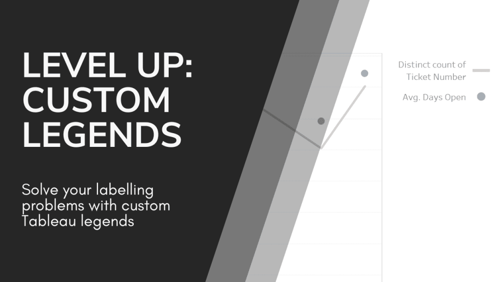
Custom legends offer a unique opportunity to align your visualisations with your branding, clarify complex datasets, and improve user engagement. Ann Pregler’s clear instructions and practical tips make it easy…
Custom legends offer a unique opportunity to align your visualisations with your branding, clarify complex datasets, and improve user engagement. Ann Pregler’s clear instructions and practical tips make it easy…
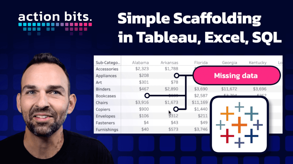
Join Jeremy Paytas as he deep dives into scaffolding – a transformative technique for organising data in a way that opens up endless possibilities for creating dynamic and insightful visuals.
How Scaffolding Enhances Data Visualization in Tableau, SQL, and Excel Read More »
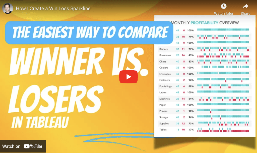
If you’re looking to add a powerful and visually-compelling tool to your Tableau repertoire, Andy Kriebel‘s post walks you through the process of creating win-loss charts – a highly effective
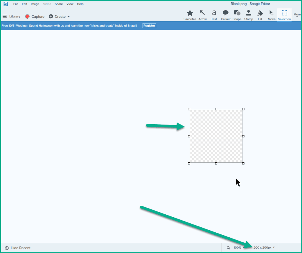
Dawn Harrington shows us how to create and use custom blank shapes with TechSmith’s SnagIt. SnagIt is an incredibly versatile tool that’s not just for screen recordings but can also
If you’re looking to take your Tableau dashboards to the next level, Uday Gundu provides a fresh perspective on how to combine the power of Tableau’s data capabilities with thoughtful
Data Meets Design: Exploring Tableau for Stunning, Insightful Dashboards Read More »
This insightful guide, with Lyndsay Betzendahl, introduces an effective method for creating multi-filter buttons that allow users to control several filters at once, all with a single click. Instead of
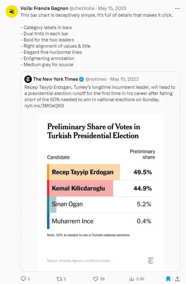
Brittany Rosenau’s post is insightful guide demonstrating how to transform ordinary bar charts into visually-captivating and engaging data visualisations. She shares step-by-step techniques to add flair to your charts while
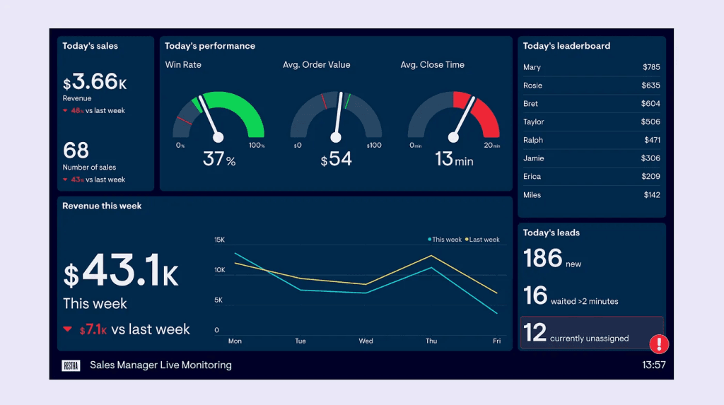
Ever built a dashboard, stared at it, and thought: “It’s “Ok…” but it’s not floating my boat…” You’re not alone. The truth is, most dashboards fail – not because they’re

Most dashboard projects start with good intentions – and end with blank stares. Why? Because they aim to look impressive instead of being genuinely helpful. But what if we flipped
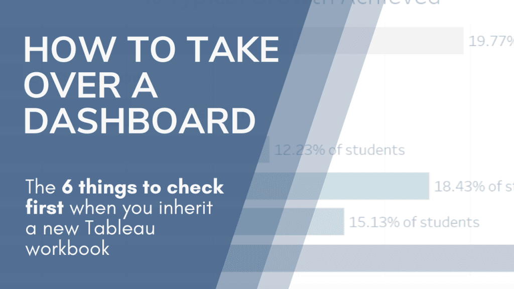
This insightful guide by Ann Pregler outlines a step-by-step process for reviewing a dashboard – from assessing data sources to understanding filters and calculations. She provides clear and actionable advice
