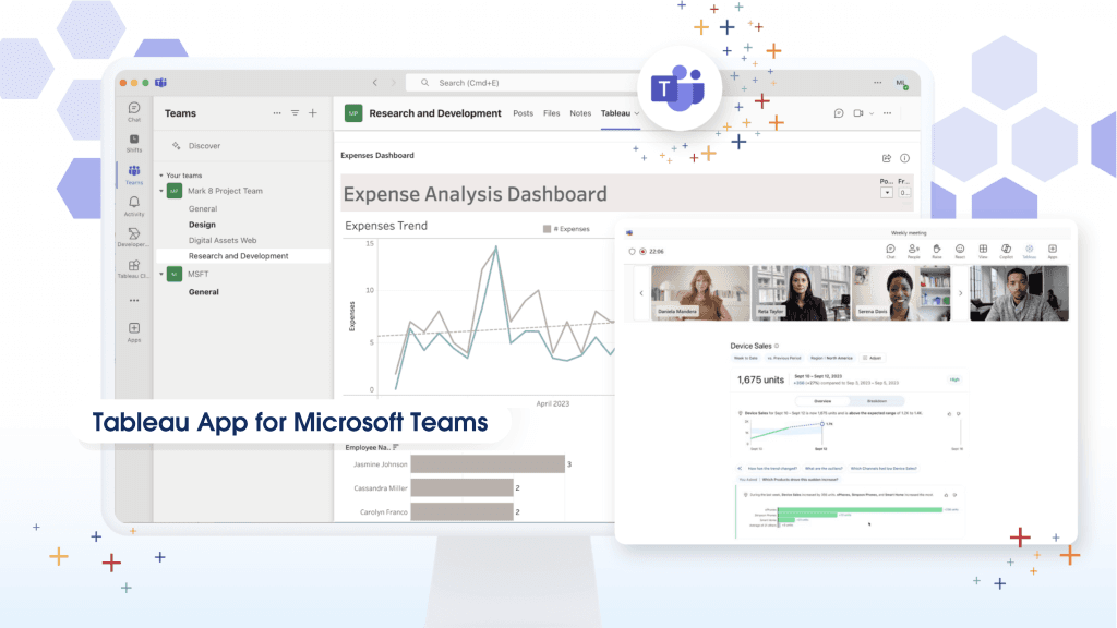
Reference Border Table Cells In Tableau
Fab post by CJ Mayes which delves deep into the nuances of bordered table cells in Tableau. He takes you on a journey from understanding the basics to exploring more…
The article by TechTipsGirl Dawn Harrington explores various methods and techniques to sort data in specific columns, offering readers an in-depth understanding of how to manipulate and organise their data
This task, for Donna Coles (Donna + dataviz), required complex computations, which she often found challenging to verify, due to the intricate steps leading to the final result. The final
Here Matt Chambers shares insights on how to transition between small multiples (a series of similar graphs or charts using the same scale and axes) and tile maps (geographical maps
Switch Between Small Multiples and Tile Maps in Tableau Read More »
Are you interested in identifying the top 30% and the bottom 30% of a population? Do you want to learn how to count the unique number of customers in these
The blog post by Steve Wexler discusses a novel approach to visualising Likert scale survey data. The Zvinca plot, named after its creator, Cristian Zvinca, is an alternative to the
In the article, Adam Mico, discusses the journey of becoming a key player in the field of data visualisation from being a subject matter expert. He emphasises the importance of
From Subject Matter Expert to Key Data Viz Player Read More »
The article, by Alyssa Huff at Playfair Data provides a comprehensive guide on how to perform advanced dynamic zone visibility in Tableau, a renowned data visualisation tool. Dynamic zone visibility
How to Do Advanced Dynamic Zone Visibility in Tableau Read More »
This comprehensive post provides a handy guide to creating automatic default chart granularity in Tableau. The author, Kasia Gasiewska-Holc introduces the concept of granularity, explaining it as the level of
Automatic Default Chart Granularity (Guest Post from Kasia Gasiewska-Holc) Read More »
The World Health Organization (WHO) has created a comprehensive guide on design language for data presentation. The guide emphasises the importance of design to effectively communicate health data to users.