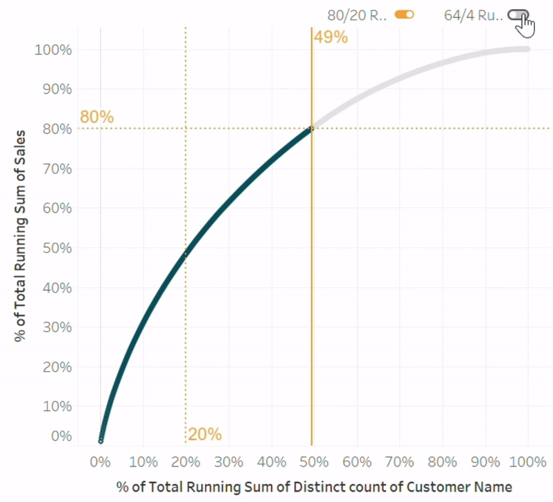
How to Make a Pareto Chart in Tableau 2.0
Whether you’re a seasoned pro or just starting your Tableau journey, this post from Juan Carlos Guzman has something for everyone. So, if you’re itching to streamline your data analysis…
Whether you’re a seasoned pro or just starting your Tableau journey, this post from Juan Carlos Guzman has something for everyone. So, if you’re itching to streamline your data analysis…
Alex breaks down the process with clarity, making it a breeze to follow along and implement these strategies in your own projects. So, if you’re itching to impress your boss
Whether you’re a Tableau novice or a seasoned pro, there’s something here for everyone to learn and apply to their own dashboards. So, if you’re eager to up your Tableau

Autumn’s notebook is a treasure trove of inspiration for anyone looking to spruce up their Tableau dashboards. What does your audience observe first? What captivates their attention? How can you
Data Visualization Techniques: An Intern’s Notebook Read More »

Demystifying Data Analytics: Your Guide to Formulas and Functions Welcome, fellow data enthusiasts, to the exhilarating world of data analytics! If you’re anything like me, you’ve probably found yourself
Demystifying Data Analytics: Your Guide to Formulas and Functions Read More »

Avoid These 10 Data Analytics Blunders: Pitfalls in Mastering Formulas and Functions So, you’ve embarked on the exhilarating journey of mastering data analytics—you Rock! But before you dive headfirst into
Avoid These 10 Data Analytics Blunders: Pitfalls in Mastering Formulas and Functions Read More »
Whether you’re a seasoned data viz pro or just starting your journey, Jonathan Schwabish’s thought-provoking analysis will leave you with a fresh perspective on the art and science of data
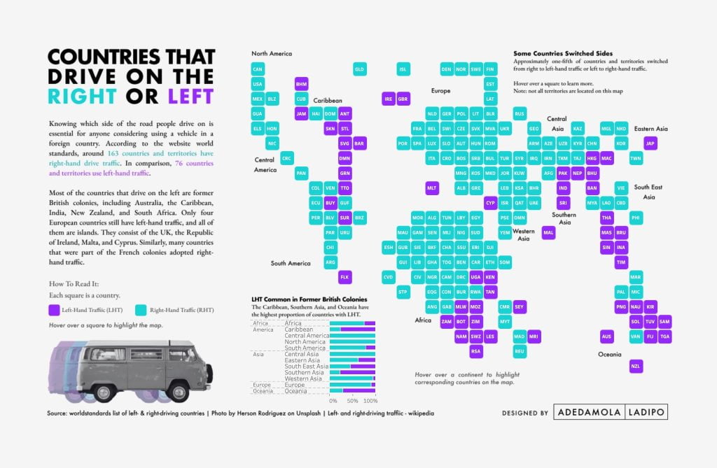
From the initial spark of inspiration to the final masterpiece, this blog from Damola promises to demystify the art of Tableau design in a way that’s both enlightening and entertaining.
A Journey Through The Design Process (Guest Blog Post by Damola Ladipo) Read More »
From game-changing updates to delightful tweaks, this blog has it all. So, whether you’re Tableau pro or just dipping your toes into the world of data viz, this blog will
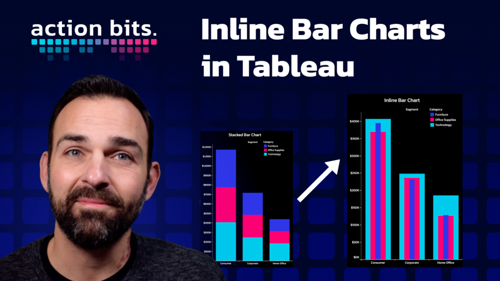
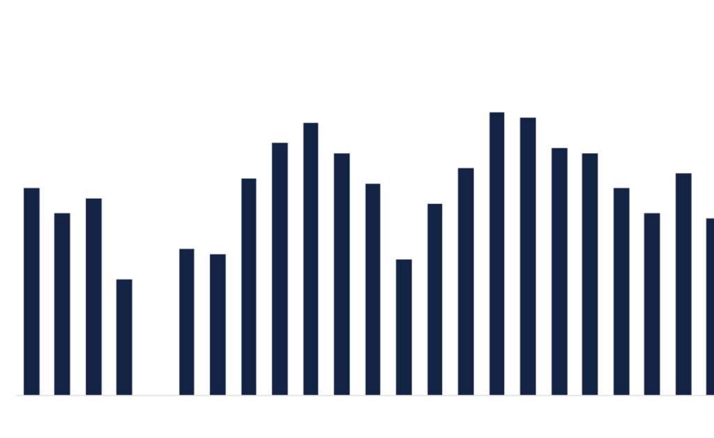
With inline bar charts, you’ll not only impress your audience but also gain new insights from your data that you never knew existed. So, if you’re ready to inject some
