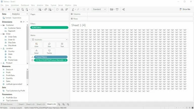
Tableau Tip: the INDEX trick By Hanna Nykowska
Hanna Nykowska from The Information Lab has a Tableau tip up her sleeve in the form of the INDEX trick, which is using the INDEX() function as a filter. This…
Hanna Nykowska from The Information Lab has a Tableau tip up her sleeve in the form of the INDEX trick, which is using the INDEX() function as a filter. This…
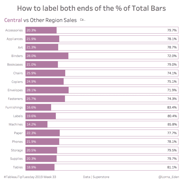
Lorna Eden demonstrates how you can label both end of the % of total bars in a bar chart. Labelling both ends of the total bars using a % of
Kicking off the first Tableau Bites of the new decade is Christopher Marland from The Information Lab’s Data School as he demonstrates how to make a span chart in Tableau.
OneNumber’s Eric Parker explains how to create a subtitle in Tableau that highlights which fields have been filtered in your dashboard. This is useful if you have created a dashboard
HOW TO CREATE A SUBTITLE IN TABLEAU THAT HIGHLIGHTS WHICH FIELDS HAVE BEEN FILTERED Read More »
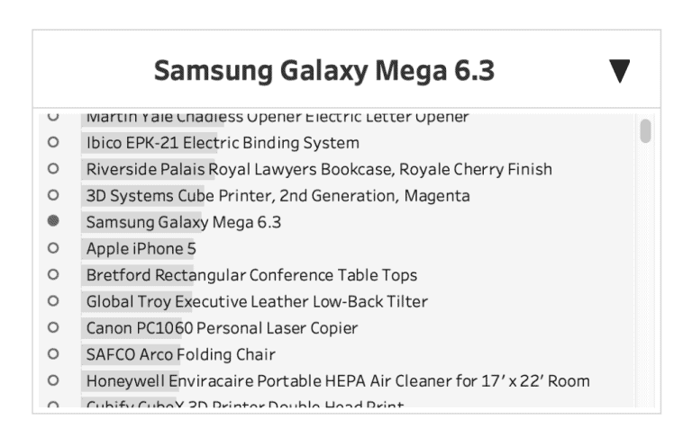
For the advanced Tableau user, 2019 IronViz runner-up participant Lindsey Poulter focuses on how you can create a custom dropdown in Tableau that uses both Parameter Actions and Show/Hide Container.
Custom Dropdown with Parameter Actions & Show/Hide Container By Lindsey Poulter Read More »

Zen Master Jeffrey Shaffer highlights some best practices for text alignment on your Tableau dashboards. Jeffrey explains how text alignment in Tableau can be used appropriately while identifying different scenarios
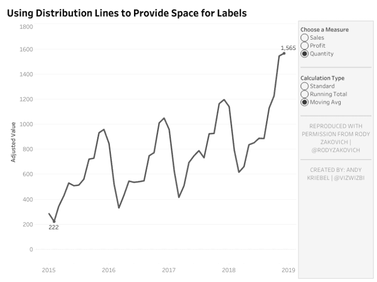
The second of two Zen Masters to feature in the first Tableau Bites of 2020 is Andy Kriebel, who has another Tableau Tip up his sleeve with using distribution lines
Using Distribution Lines to Provide Space for Labels By Andy Kriebel Read More »
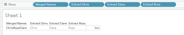
Ross Easton from The Information Lab’s Data School gives you a basic introduction into string calculations in Tableau. Ross focuses on the left, mid and right functions of string calculations,
AN INTRO TO BASIC STRING CALCULATIONS: LEFT, MID AND RIGHT FUNCTIONS Read More »
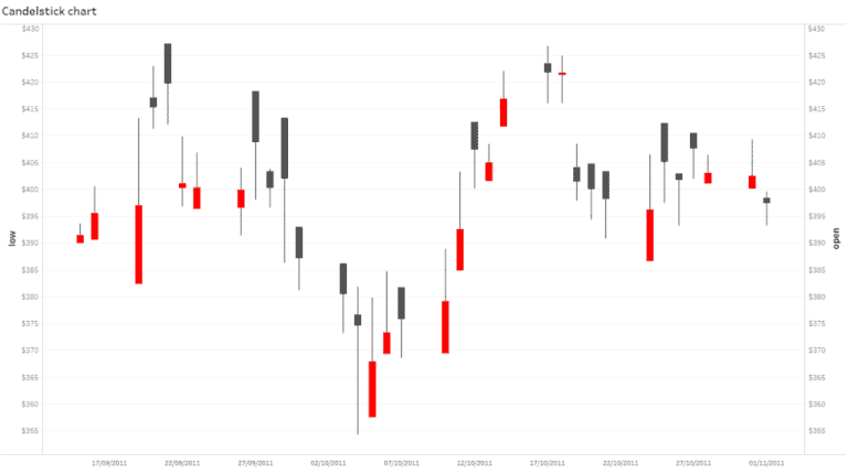
Starting off the final Tableau Bites of 2019 is Anna Prosvetova from The Information Lab’s Data School, who shows you how to build a candlestick chart in Tableau. A candlestick
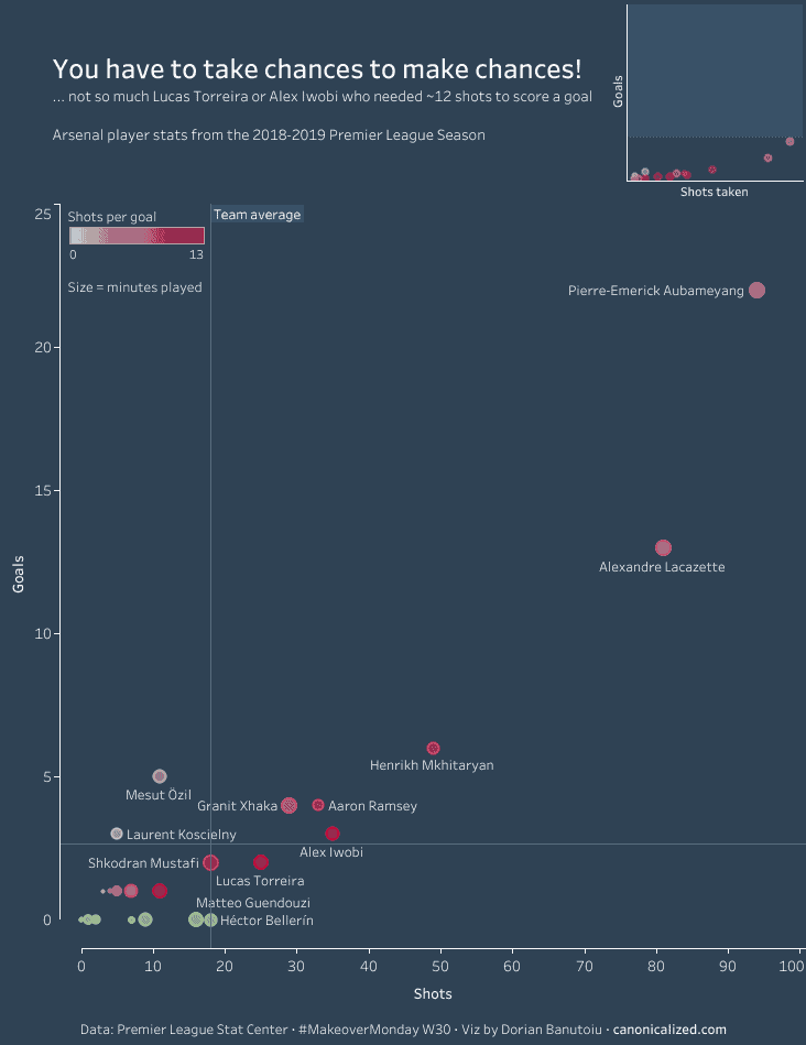
Dorian Banutoiu from Canonicalized highlights the most common issues that you are likely to deal with when using a scatter plot in Tableau. A scatter plot is great for showing
Dealing with common Scatter Plot issues By Dorian Banutoiu Read More »
