HOW TO MAKE A SPAN CHART IN TABLEAU

Want to Get Latest Updates and Tips on Tableau Bites Blogs

ddfd92ef 52c9 4127 843e 4061eaafd6ce

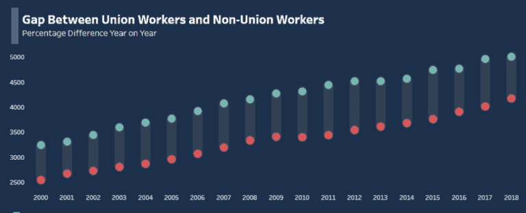
Kicking off the first Tableau Bites of the new decade is Christopher Marland from The Information Lab’s Data School as he demonstrates how to make a span chart in Tableau.

A span chart can be used to display data across a minimum and maximum range. Whether if it’s looking at company department productivity or annual employee wages, a span chart is great for Tableau dashboard designers working in the human resources industry.

Read Original Article…

Share This Post:

001 database

Tableau Training on
Tap Fast Track

data scientist 1

Tableau Advanced Analyst

002 bar chart

Tableau
Foundation

003 network

Tableau Training
on Tap

Share :

Leave a Comment

Your email address will not be published. Required fields are marked *