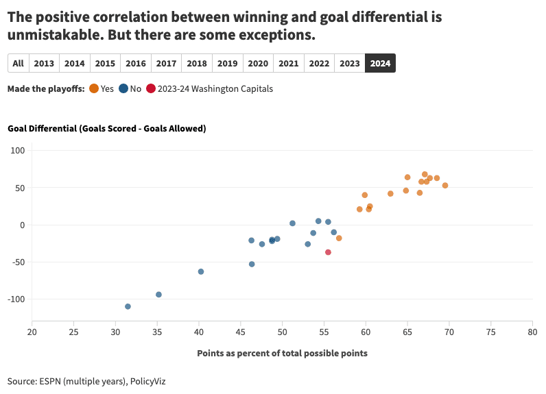
This article, with Jonathan Schwabish, offers an exciting blend of sports analysis and data visualisation. It breaks down the team’s performance in a visually compelling way, showcasing how statistics and data can offer fresh insights into the world of sports. It delivers a unique perspective on the team’s success through data-driven storytelling.
The post demonstrates how data visualisation can enrich your understanding of sports performance. From player metrics to team trends, you’ll discover new ways to interpret and appreciate the team’s road to the playoffs. Perfect for both Tableau users and sports fans alike, this article is a fascinating intersection of data analytics and sports excitement. Dive into the world of hockey and data visualisation and see how numbers can amplify the thrill of the playoffs!


