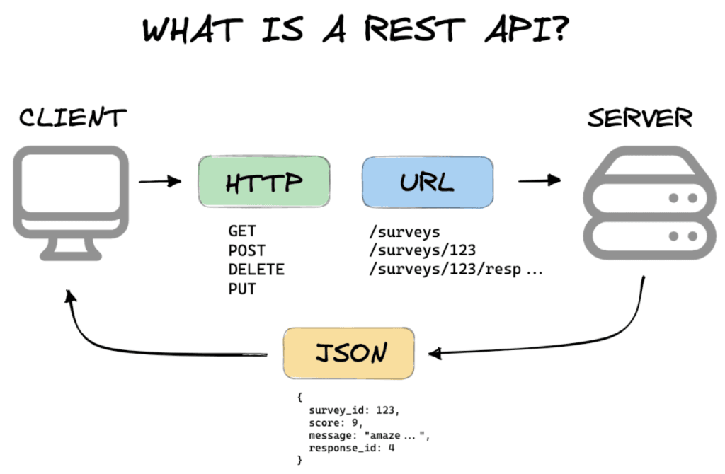
Consistent Symbol Usage
WHO’s symbology system ensures that symbols and icons are easy to interpret, even in different cultural and linguistic contexts. This is crucial for public health communication and so particularly valuable…
These challenges are designed to keep things fresh and exciting. Plus, this post with Dawn Harrington, offers practical tips and advice to help you stay consistent and succeed in each
Data preparation is often the most critical step in the analysis process, and this guide with Leah N simplifies it by walking you through the key steps of importing different
Ready, Set, Tableau: How to Import and Clean Your Data Read More »
If you’re building a data analytics portfolio, Olivia DiGiacomo’s guide is a valuable resource to help you stand out. It dives into five foundational chart types that are not only
Build Your Data Analytics Portfolio with These 5 Essential Chart Types Read More »
If you’re striving for consistency and professionalism in your data visualisations, the Kraft Heinz Data Visualisation Style Guide is an essential resource to explore. This guide, by Amy Cesal, offers
Andy Kriebel’s video tutorial makes it easy to implement this powerful visualisation, even if you’re new to the concept. Through clear instructions, he explains how to build and customise the
Felicia Styer’s tutorial introduces a dynamic way to display hierarchical data. Semi-sunburst charts are especially effective for showing relationships within layered data – such as organisational structures or category breakdowns.
Here’s a great post with Yvette Kovács sharing simple, yet impactful tips that can make a world of difference in your Tableau experience. Her tips are designed to streamline workflows,
Here, Jennifer Dawes shares her personal experiences from this high-stakes competition – highlighting the creativity, commitment, and resilience needed to excel. Through her storytelling, you’ll get an insider’s perspective on
Reflecting on My Tableau Iron Viz Journey: Lessons Learned and New Directions Read More »
If you’re looking to add more interactivity and precision to your Tableau dashboards, Brenda Dorianny Chavez’s tutorial is the perfect resource by adding a level of customisation that not only