Interesting data is probably wrong
Mike Cisernos blends a personal story with practical lessons about data humility, careful checking, and the responsibility that comes with sharing insights. Rather than discouraging curiosity, he encourages you to…
Mike Cisernos blends a personal story with practical lessons about data humility, careful checking, and the responsibility that comes with sharing insights. Rather than discouraging curiosity, he encourages you to…

Even if you’re already familiar with accessibility basics, Eric Parker frames the real-world importance of accessibility in data viz and directs you to tools (like colour contrast checkers and screen
Jennifer Dawes’ reflection challenges the notion that every viz must end up crystal-clean, polished, and “presentation-ready.” Instead, give yourself permission. Permission to leave something incomplete for a while, to let
When the Work Goes Quiet – The Unfinished Vizzes Writer Read More »
Francesca Plaskett gives step-by-step instructions – from creating the parameter, to building a “move-to-top” calculated field, to even adding a visual marker (like a circle) so the selected category really
Bopping to the top – Moving your selected category to the top of your chart in Tableau Read More »
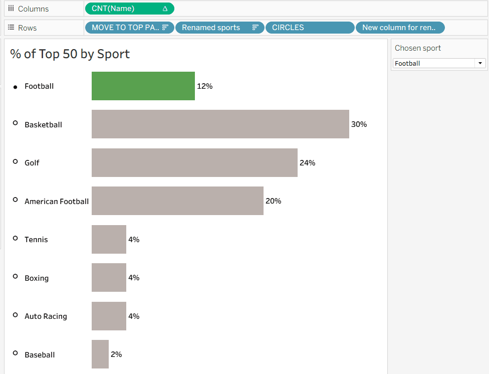
What makes the post especially useful is its practical tip on how to apply separate colour legends per measure – so a percentage-based metric doesn’t get washed out next to

Frederic Fery reflects on how data visualisation can become a strategic asset for non‑profits – helping them embed data practices into their long‑term operations, strengthen transparency, and tell their impact
Stephen Osserman shows a real example of how data‑driven communities can emerge organically, how visualisation can be a social act rather than a solo project, and how people can support

Jennifer Dawes‘ post captures the spirit of growth, community, and renewed purpose. It’s a reminder that progress isn’t always linear: sometimes it’s slow, sometimes invisible, but worth honouring. If you
Closing Out 2025: A Year of Growth, Gratitude, and New Beginnings Read More »
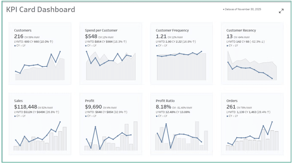
Dawn Harrington walks you through an example using well-known metrics – like sales, profit, orders, and customer counts, to show how to build effective KPI-driven dashboards with minimal clutter. If

Beyond just setup, Nick Feldman’s post offers a clean, human-friendly breakdown of what really changes when you move to Tableau Cloud – covering differences in data connectivity, update cadence, administration,
So, You’ve Migrated to Tableau Cloud. What’s Next? Read More »
