Tableau-bites
Five Ways to Make Tableau Dashboards Run Faster (Part 1: Data and Query Tips)
Stephanie Shorey-Roca post is a balance of diagnosis and action: it doesn’t just tell you what might be slowing things down, it gives you how to fix it – walking
Five Ways to Make Tableau Dashboards Run Faster (Part 1: Data and Query Tips) Read More »

Semantic Models in Tableau Next
Olivia Grace Millar’s post mixes high-level insight with tangible steps: you’ll see how to add tables, union or join them in a logical view, create reusable objects and then link
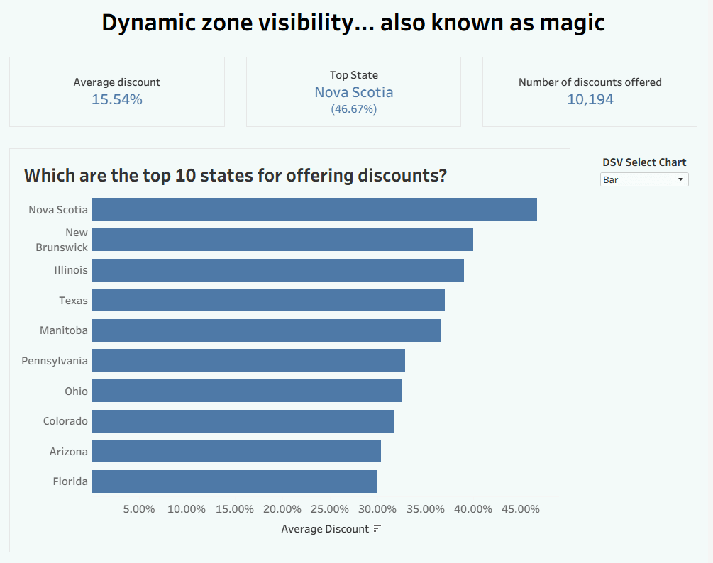
Could it be magic? No, just dynamic zone visibility
Francesca Plaskett’s article combines the “why” and “how”. You’ll get a clear rationale for using dynamic chart selection (e.g., cleaner dashboard space, making insights more discoverable) and a walk-through of
Could it be magic? No, just dynamic zone visibility Read More »

How to Build Dynamic Parameters in Tableau
Eric Parker’s post (and YouTube video) not only highlights the user-experience gains of dynamic parameters (like reducing workbook maintenance and improving flexibility),but also shows you step-by-step how to set them

How to create a Light-Dark Mode viz in Tableau
Find step-by-step instructions, by Shreya Arya, to set up a toggle parameter, create boolean calculated fields, decide when to duplicate sheets vs when you can reuse one with conditional formatting,

Recycle Bin for Tableau: Soft Deletes, Big Implications
Kyle Massey dives into the Recycle Bin feature in Tableau, explaining how on the surface it looks like a simple safeguard – deleted content can be restored, but in practice
Recycle Bin for Tableau: Soft Deletes, Big Implications Read More »

Grey Out Irrelevant Areas (Dynamic Zones #7)
In Ann Pregler’s post, you’ll see exactly how to create parameters, build calculated fields for each “zone” you want to grey out, design semi-transparent overlays, and apply the Dynamic Zone
Forcing Needed Values that Don’t Exist Yet in Your Data
Lindsay Betzendahl’s solution is simple yet powerful: build a tiny lookup table with all the expected status values, union it with your real data, and then you can force those
Forcing Needed Values that Don’t Exist Yet in Your Data Read More »

Why Storytelling With Data Matters for Business and Data Analysts
Storytelling isn’t shown here as a “nice-to‐have”, but a core capability for anyone who wants their insights to matter. Rashi Desai’s explains how you can craft a clear message, tailor
Why Storytelling With Data Matters for Business and Data Analysts Read More »
