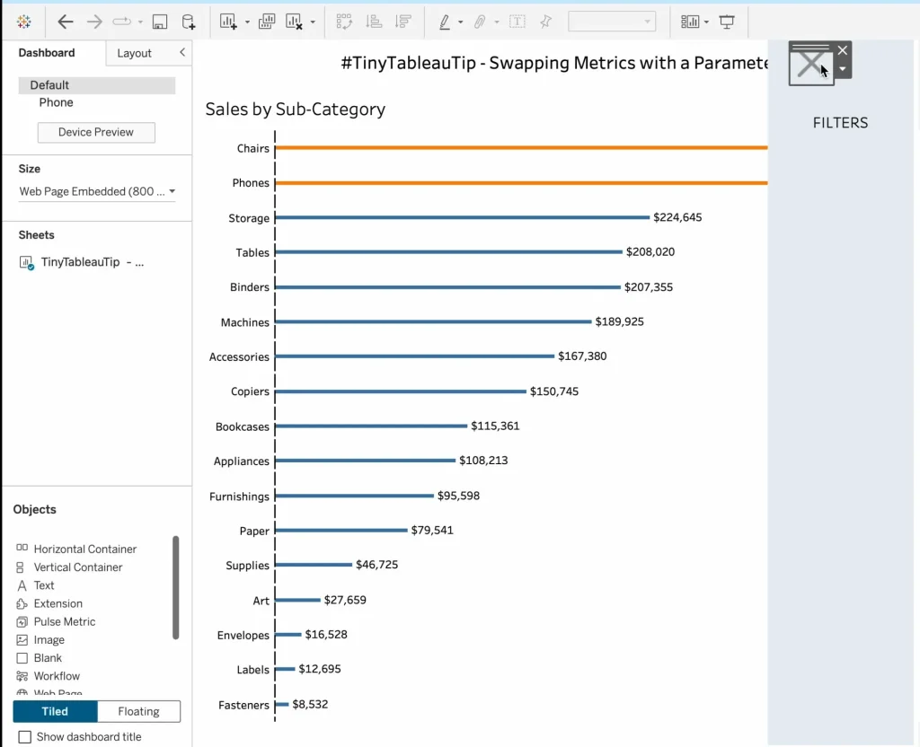
TinyTableauTip – Guest Host Umar Hassan
But the value here goes beyond just the tip itself – it shows the ripple effect of community and mentorship. Umar Hassan is part of the Tableau Sandbox Buddy program,…
But the value here goes beyond just the tip itself – it shows the ripple effect of community and mentorship. Umar Hassan is part of the Tableau Sandbox Buddy program,…
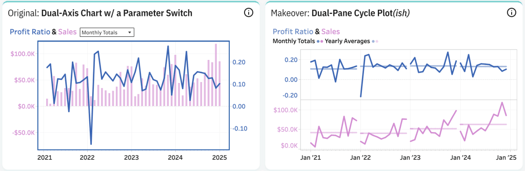
Beyond just pretty visualisations, Kevin Wee’s dashboard is an invitation to question your assumptions. What do the divergences tell you? Are there hidden relationships between these two metrics you hadn’t
Dual-Pane Cycle Plot(ish): An Alternative to Dual-Axis Chart Read More »

But, insight without execution is like a map with no path. That’s why Shaun Davis‘ article goes further: it shows you how to pick just 3–5 “big moves” (not ten

Especially useful is how grounded the narrative is. Each “fail” is followed with lessons learned – best practices that feel immediately applicable. Baraa Khatib Salkini’s reflections help you sharpen your

In this episode with Zach Bowders, Joshua Milligan explores what it’s like to write in a technical space, unpack the latest Tableau features, and reflect on where data visualisation, and
This approach keeps your interface clean and efficient, eliminating the need for scrolling and ensuring that only the most relevant information is displayed at the right time. Check out Andy
Build a Mobile Dashboard with Dynamic Zone Visibility Read More »
You’ll not only pick up techniques for layering motion and form, but also gain an appreciation for the iterative mindset that drives innovative visual design. Whether you’re building static dashboards
Dan Chissick’s post doesn’t stop at theory, he walks you through a tested step‑by‑step process for “moving” calculated fields from the published data source into your workbook (so they become
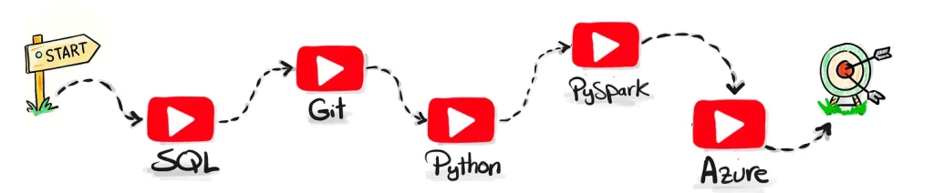
Baraa Khatib Salkini calls out drawbacks, strengths, and where learners often get stuck. He warns about outdated content, overpaying for hype, or getting lost when the roadmap isn’t clear. Because
As always with Tableau, there’s more than one way to solve a problem, and in this guide, Jim Dehner and Tore Levinsen walk through several effective techniques. Whether you’re refining
TinyTableauTip – Different Ways to Solve Combo Chart Read More »
