Explore World Heritage Sites
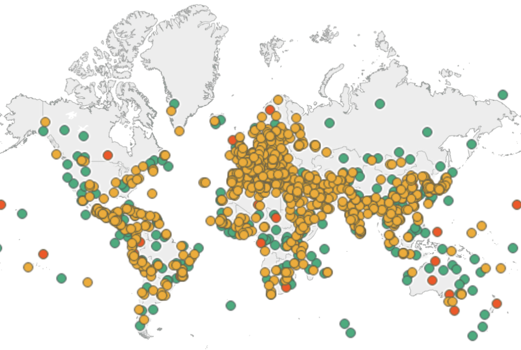
Beyond the visual appeal, Yusuke Nakanishi’s dashboard is also a powerful learning tool. It gives you context: site ages, categories, and geographies, helping you see patterns (for instance, clusters in…
Beyond the visual appeal, Yusuke Nakanishi’s dashboard is also a powerful learning tool. It gives you context: site ages, categories, and geographies, helping you see patterns (for instance, clusters in…
You get a clear sense of when AI helps speed things up (for example, generating column logic or handling text splits) and when it can trip you up. Robert Rouse
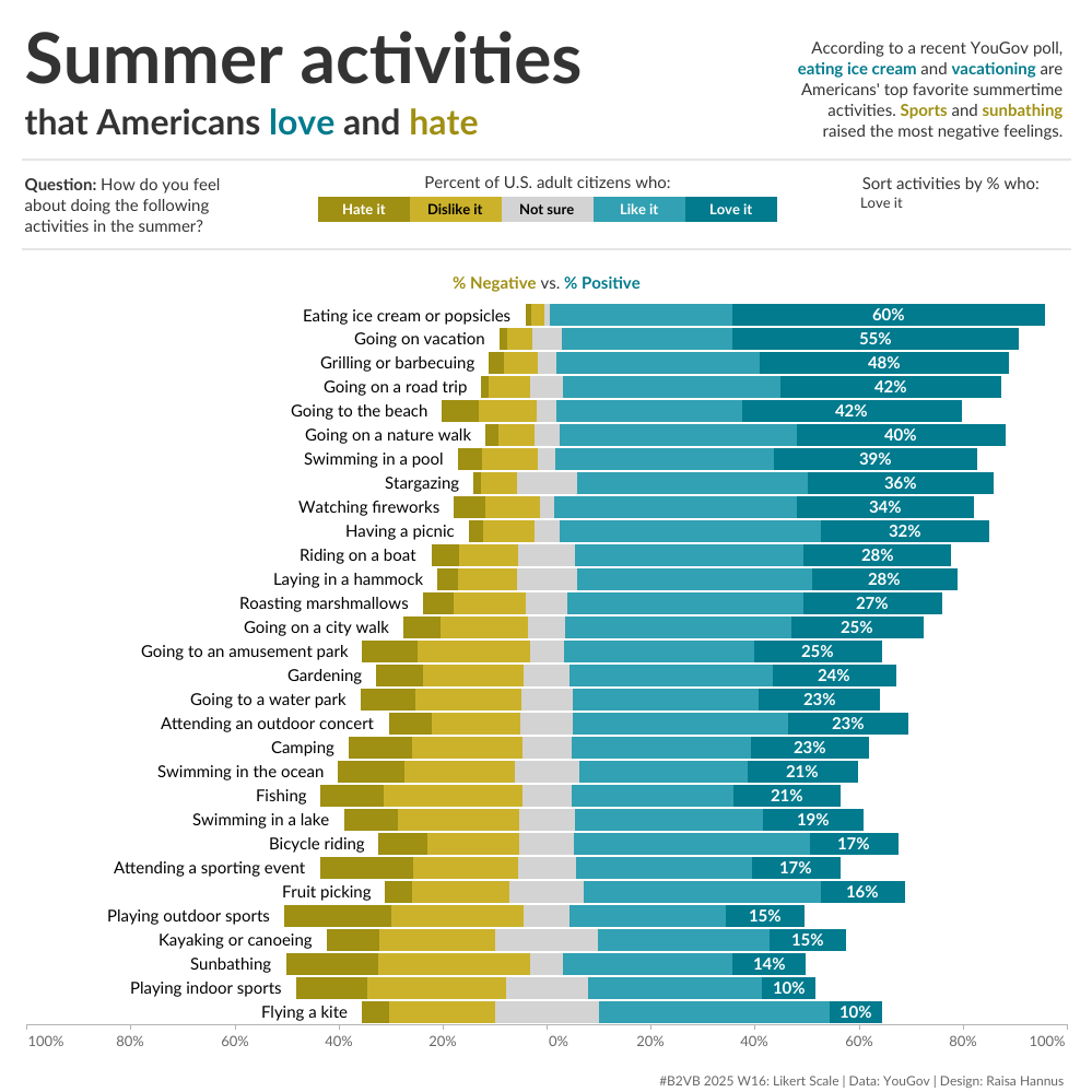
What’s more, this is a great chance to sharpen your visualisation muscles. Eric Balash’s post gives you the actual dataset (from a YouGov survey of over a thousand people) to
Tore Levinsen clearly explains, with screenshots and step‑by‑step guidance, plus links to a video so you can see how it’s done in practice. Whether you’re building dashboards for yourself, clients
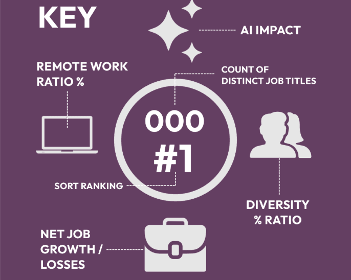
Beyond the curiosity factor, this Joel Reed’s dashboard is a powerful tool for insight. It can help you think strategically: which skills are becoming more important, what sectors might offer
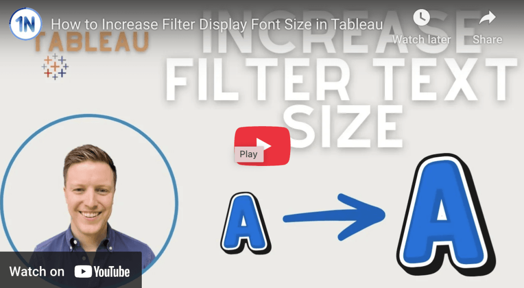
Second, it’s practical. This isn’t just theory, you get step‑by‑step instructions, and video support, so you can see exactly how to implement the fix. If you use Tableau regularly, this
How to Increase Filter Display Font Size in Tableau Read More »
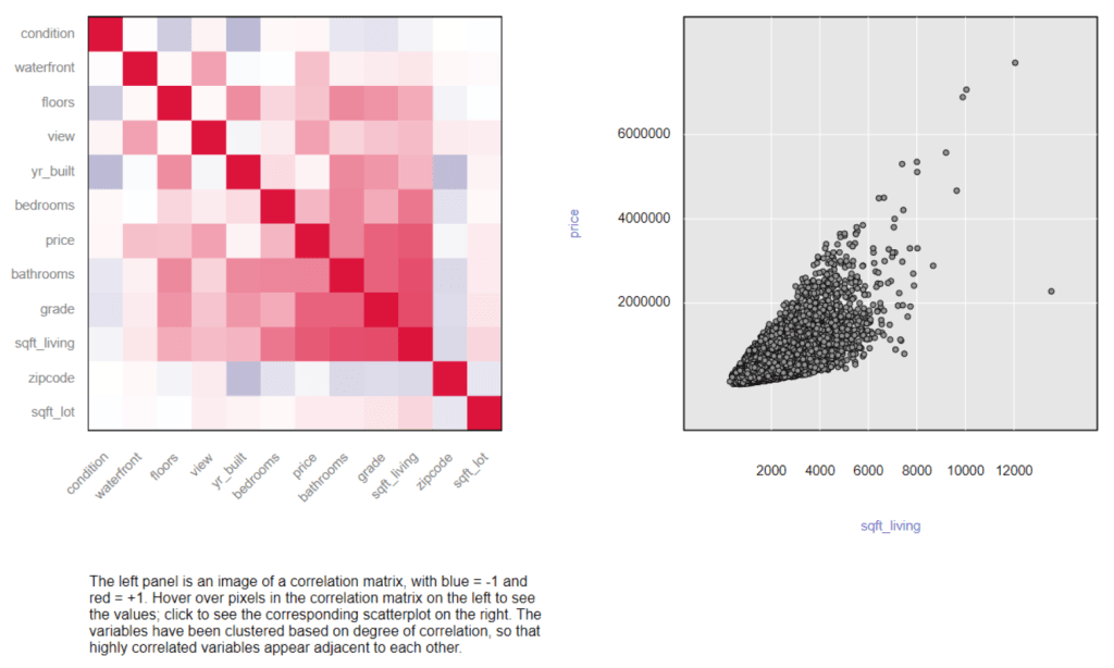
It doesn’t just stay in theory, it shows how to do correlation tests, what assumptions you need to check, what outputs look like, and how to interpret things like the

Robert Curtis gives practical advice on how to push back against the chaos, how to refocus on goal alignment, executive sponsorship, and building strategy as a living, adaptable document. Find
The Biggest Pain Points for Data and Analytics Leaders: Strategy Read More »
This post is a fantastic window into what a creative journey can look like. Jennifer Dawes takes you through a less often discussed part of the design process: turning vision

Haleigh Schwartz dives into things like parameter actions, image roles, overlaying data with custom images, and clever tricks like invisible shapes to make interaction feel smooth but seamless. The post
