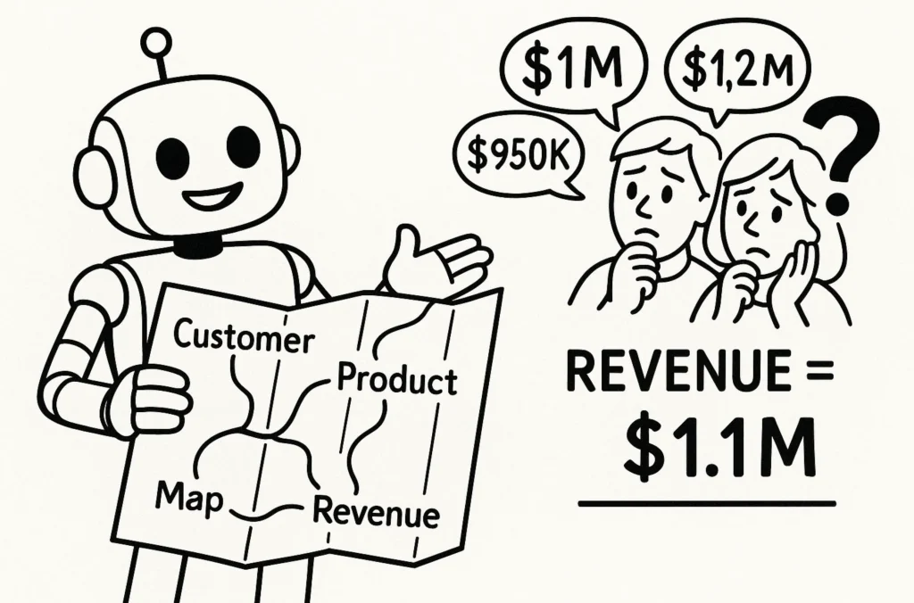
Understanding STATS in Data Analysis
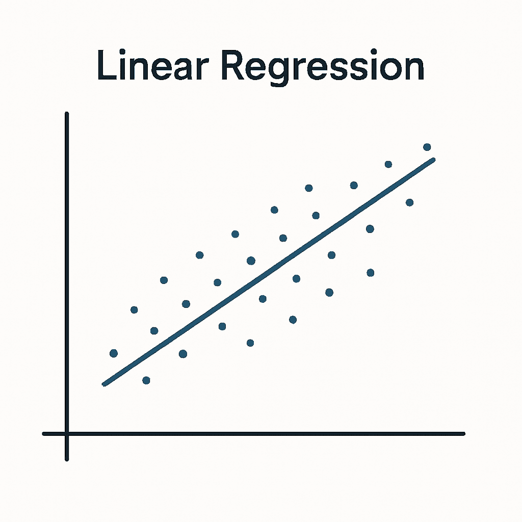
Rather than treating each concept as unrelated, Younes Ghouini shows how standard deviation, outliers, Z‑scores and regression interact to help you move from raw data to solid insight. After reading,…
Rather than treating each concept as unrelated, Younes Ghouini shows how standard deviation, outliers, Z‑scores and regression interact to help you move from raw data to solid insight. After reading,…
Shaun Davis gives structured steps for week one and week two: things like holding a “truth meeting” to air concerns, documenting data flows, running “pulse checks” with your critics, and
When Nobody Trusts Your Data: The Two-Week Reset Read More »
This isn’t just theory, Ollie Linley shares tips he applies every time, and you get real examples and inspiration for how to start crafting your own design style. For anyone
Baraa Khatib Salkini doesn’t pretend it was perfect or easy – he was overwhelmed, confused, and learning by trial and error. Yet by being curious, proactive, and by taking small
How I’d Become a Senior (If I Had to Start Over) Read More »
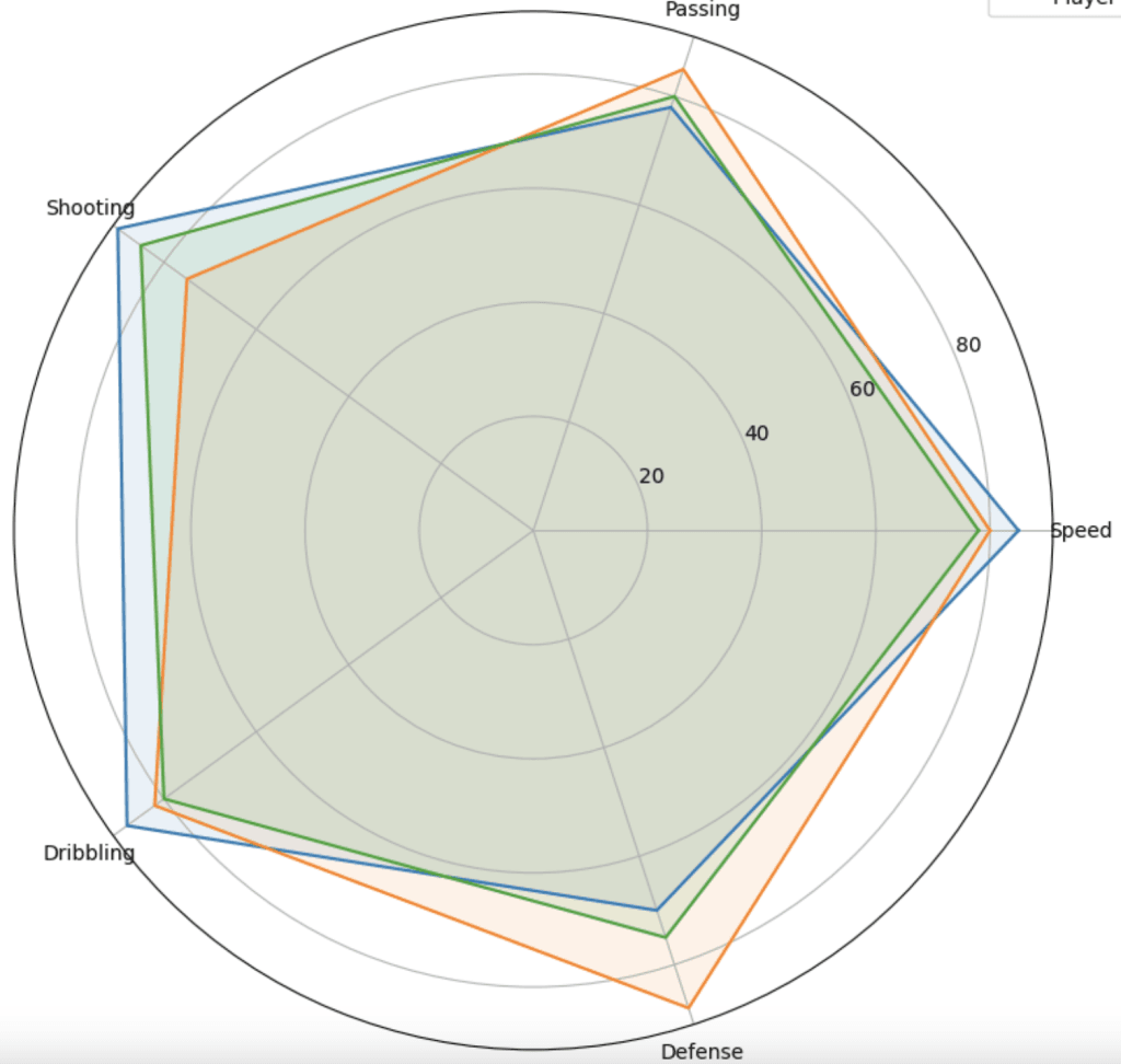
Joseph Darton’s piece doesn’t just explain Z‑scores; it shows you how to use them with real data visualisations in tools like Tableau. You’ll see radar charts, boxplots, and step‑by‑step instructions
Why are Z-Scores used in sports performance analysis? Read More »

What makes Jennifer Dawes post especially valuable is how she gives you access to her process: the sketches, experiments, time constraints, colour/accessibility choices – all of which often remain invisible
Practicing in Public: My Journey with Makeover Monday Read More »
Beyond just theory, Annabelle Rincon’s article walks you through a hands‑on modelling example with a bookstore dataset, showing how you can practically set up semantic models, define relationships, build logical
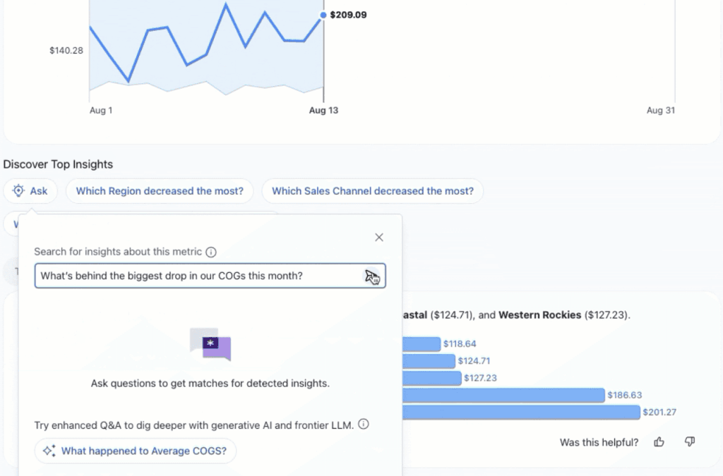
Beyond that, there are improvements aimed at making the analytics experience more intuitive, secure and collaborative. Roll‑over time ranges, region‑aware LLMs, richer mobile metric discovery, and stronger integrations (Teams, Google

Many local governments recognise the promise of data but struggle to turn that potential into real-world impact. Between legacy systems, cultural resistance, and limited resources, it’s easy for “data-driven” to
From Skepticism to Strategy: Building the Data-Driven Culture Local Government Needs Read More »
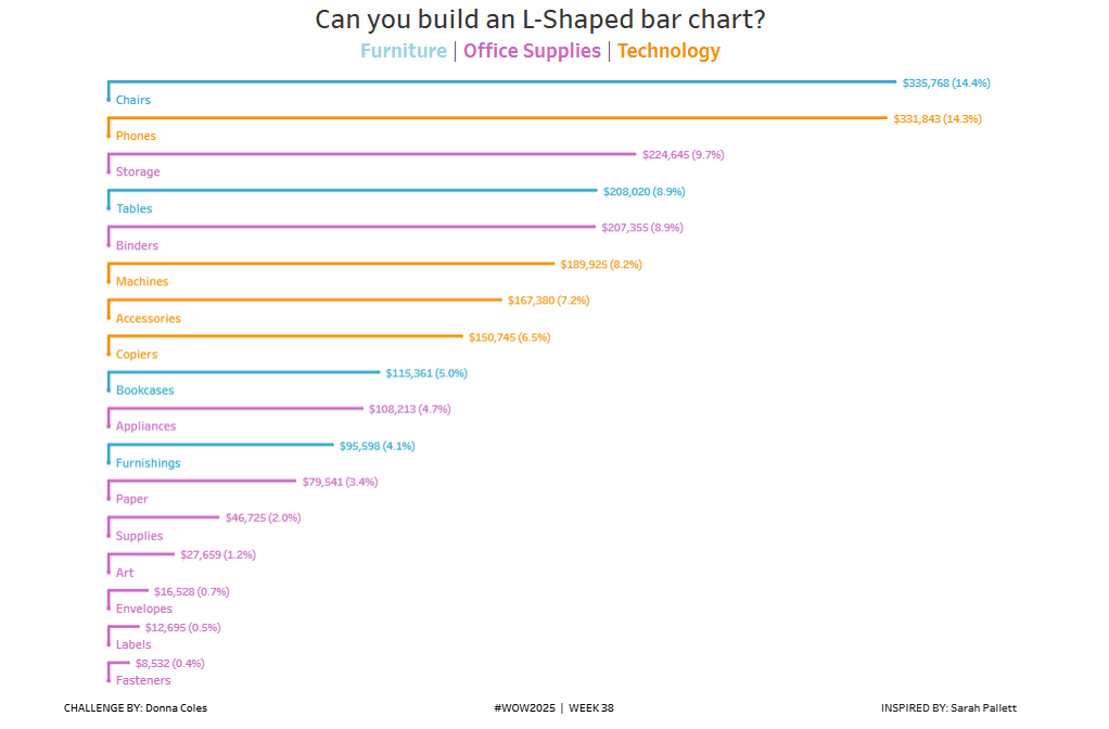
With Donna Coles, you get concrete requirements to work to (size, label placement, colour, ordering), plus inspiration via Sarah Pallett’s original L‑shaped bar post. There’s space to be creative: you
