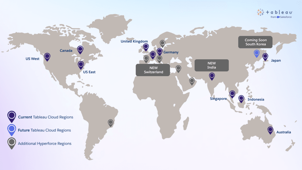
What to Know About Tableau Cloud on Hyperforce
What’s really exciting is that the migration doesn’t force users to relearn their workflows or lose features – everything you already know in Tableau Cloud remains, but under the hood…
What’s really exciting is that the migration doesn’t force users to relearn their workflows or lose features – everything you already know in Tableau Cloud remains, but under the hood…
These techniques are both creative and practical. Johan de Groot walks you through ready-to-use examples, complete with downloadable workbook files so you can see exactly how containers, blank elements, padding,
Tableau Container Art – 4 examples of formatting dashboards without images Read More »

Discover a curated mix of creators and content styles. Whether it’s Andy Kriebel’s layout-tricks videos, Sqlbelle’s beginner-friendly walkthroughs, or OneNumber’s deep-dives into more advanced concepts, there’s something useful for your
How I Taught Myself Tableau: The Best Resources I Still Use Today Read More »
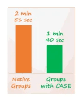
If you’ve ever built dashboards in Tableau with large datasets, you know that even small conveniences (like grouping items) can sometimes cost you big time in speed and performance. Here,

Ever wondered how storytelling can elevate both your career and your impact in the data space, this episode of Data unDUBBED is a must-listen. Sarah and Fiona sit down with
Fakayode Emmanuel’s dashboard is built for exploration. You can filter by demographics, plan type, or behaviour to see how churn behaves in different slices of users. Whether you work in
“What are the top challenges you face while self-learning Tableau?” This question was posed by Ojoswi Basu to over 300 members. He pulled the answers together to compile a reference
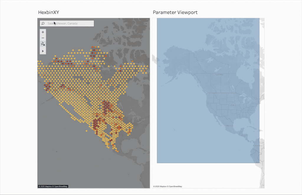
From scalable hexbins to synchronised zooms, this update brings interactivity and precision to spatial analysis like never before – all available in Tableau Cloud and Desktop. Read on with Roxanne
Get Interactive with Dynamic Spatial Parameters in Tableau Read More »

What makes this article more valuable is its dual-purpose lens: it’s equally focused on helping others learn as well as supporting your own journey. Sarah Pallett highlights trusted voices and
Tore Levinsen’s post, featuring Louis Yu (on YouTube) goes through these tips, which includes how to apply different formats between labels and tooltips. The clever trick? Duplicate the measure on
