
Fun Ways to Tackle 6 Tough Problems
What if you could approach complex challenges with more creativity and less stress? Jim Dehner is all about that- exploring diverse techniques, learning small but powerful tricks, and discovering new…
What if you could approach complex challenges with more creativity and less stress? Jim Dehner is all about that- exploring diverse techniques, learning small but powerful tricks, and discovering new…
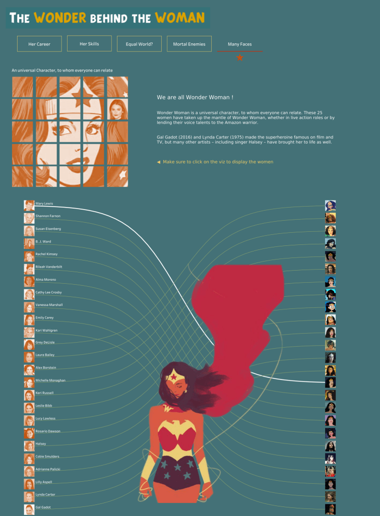
Annabelle Rincon’s article is great for anyone looking to grow through community. It walks through three meaningful collaboration stories: “The Wonder Behind the Woman” (with Joshua Preston), “Birdwatch” (with Neil

Baraa Khatib Salkini dives into powerful habits worth cultivating: focusing on solving meaningful problems over chasing tool trends, co-building with stakeholders instead of hiding behind dashboards, weaving compelling data stories
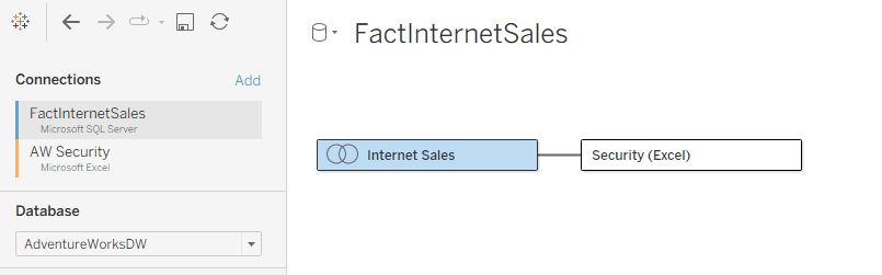
Dan Chissick shares how a customer discovered this problem only after migrating dozens of data sources, leaving them scrambling to rebuild their flows mostly by porting static files into database

Ian Klosowicz‘s advice is practical and grounded. For anyone ready to break into data analytics, whether you’re just starting or feeling stuck, this is a motivational and tactical springboard worth
The fastest way to land your first data job (and avoid the burnout loop) Read More »
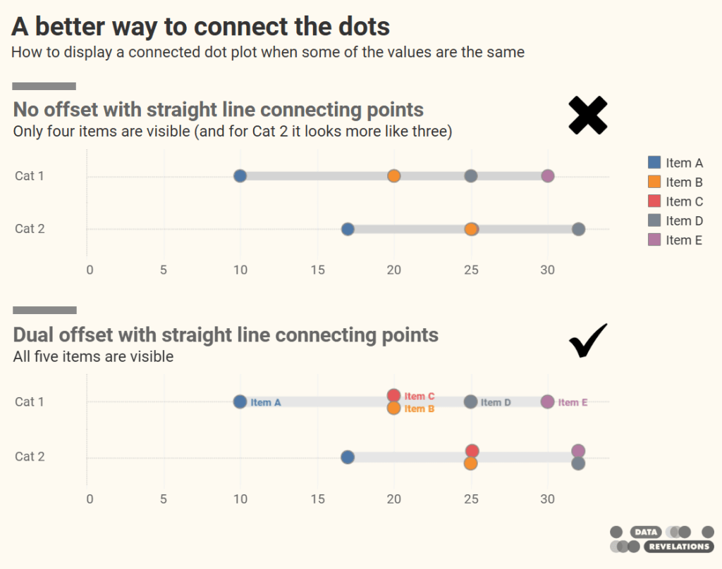
Steve Wexler reveals a subtle (yet impactful) design enhancement: ditching the legend entirely. By using direct labelling on only the first row’s dots and cleverly enabling “Always show” labels via

What stands out in Sarah Pallett’s story is the shift from practice to purpose. By consistently engaging with structured community challenges, she learned through doing, and built a body of
From Practice to Purpose: How Tableau Community Projects Accelerated My Career Read More »
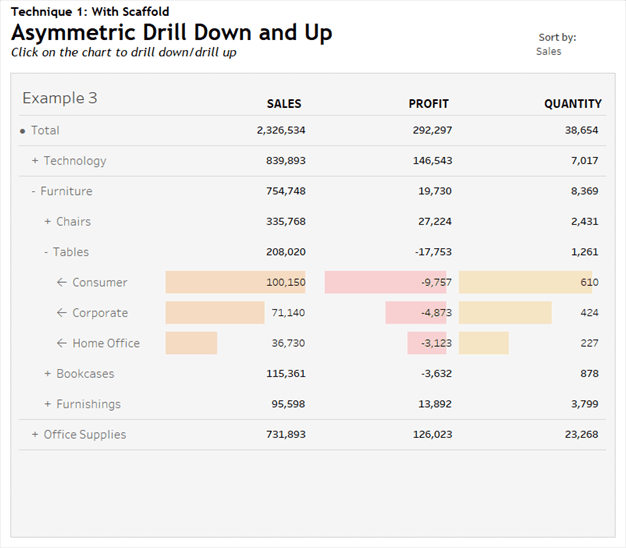
The real standout, though, is the scaffolding technique that powers this interactivity. Rosario Gauna walks you through how to construct both explicit scaffolding, using an auxiliary table to define hierarchical
Asymmetric Drill Down Using Scaffolding Technique Read More »
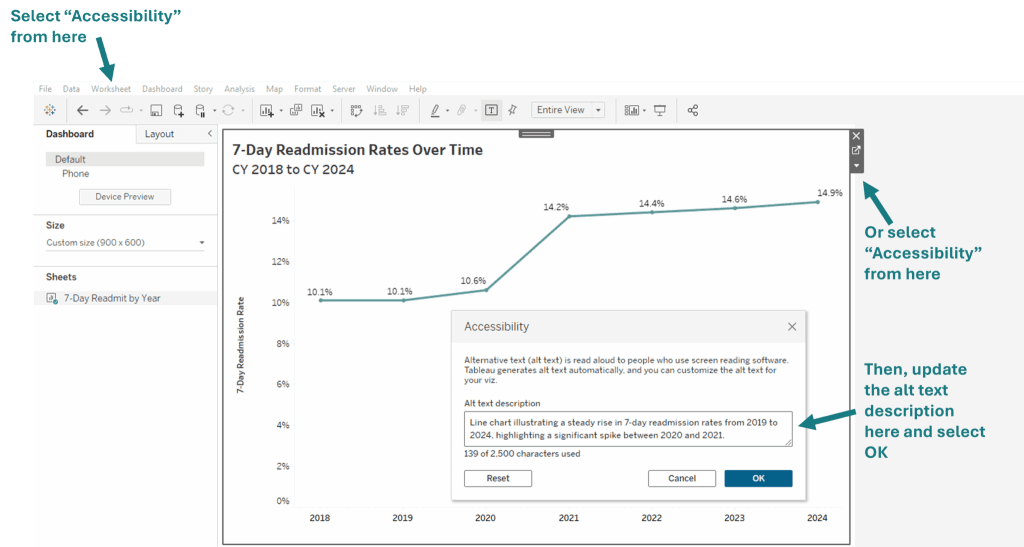
Stephanie Shorey-Roca highlights the power of keyboard accessibility enhancements added in Tableau 2024.3 and 2025.1. With Viz Navigation, users can explore marks using arrow keys and interact with dashboards without
Accessible by Design: Making Data Visualization More Inclusive with Tableau Read More »
What sets this article apart is the practical angle – and the small tricks that make a big difference. Ethan Hahn shares tips that go beyond theory, offering strategies that
Measure Names & Values Overview with Some Tips & Tricks Read More »
