Designing for Trust, Not Just Answers
Celia Fryar and Blake Wade’s article emphasises that organisations shouldn’t expect users to remember every definition or nuance themselves – instead, those definitions should be embedded directly into the data…
Celia Fryar and Blake Wade’s article emphasises that organisations shouldn’t expect users to remember every definition or nuance themselves – instead, those definitions should be embedded directly into the data…
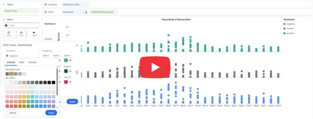
Kat Rocha’s article focuses on real, actionable techniques you can apply immediately. From keeping layouts clean and using whitespace effectively, to guiding users with thoughtful color choices and adding interactivity
What makes Johan de Groot’s post particularly engaging is how it blends design thinking with practical Tableau techniques. Instead of focusing only on aesthetics, it demonstrates how thoughtful layout and

If you’re considering going to Tableau Conference, or just curious about why so many people in the data community love it, this post offers a practical and personal perspective that
Tableau Conference Registration Is Open. Here’s How I Think About Whether It’s Worth It Read More »
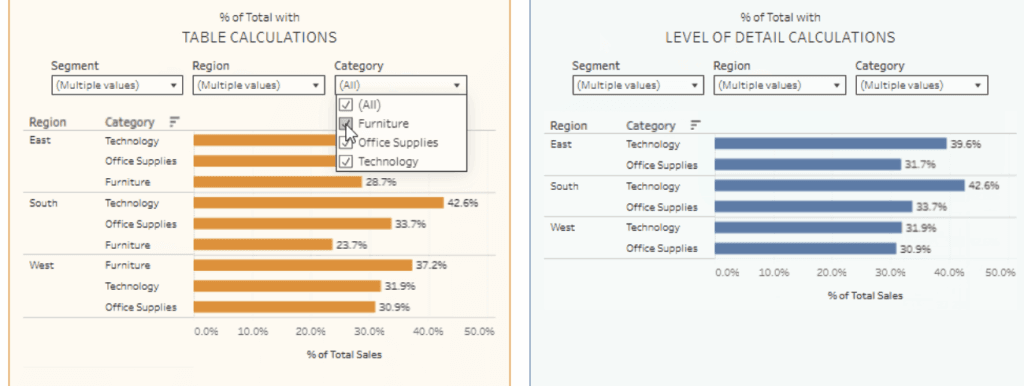
Donna Coles demonstrates how the calculations work in real scenarios, such as computing percentages of sales by region and handling filtering behaviour correctly. This side-by-side comparison highlights an important Tableau

Mark Bradbourne’s dashboard is both interactive and educational. By exploring the options and seeing examples in action, you can quickly understand how different chart types communicate insights in different ways.

What makes this tool especially interesting is how it reflects a broader trend in AI: creating specialised GPTs focused on specific domains or expertise. Platforms like ChatGPT now allow users
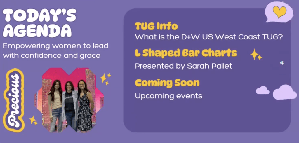
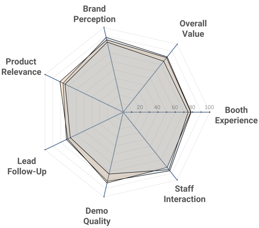
This session, with Ann Stolzman, Michelle Maraj and Tiania Chan, also features a talk from Sarah Pallett, as she dives into the idea behind L-shaped bar charts, sharing how thoughtful

What makes Adam Mico’s article especially compelling is the diversity of stories behind each rising star. From community organisers and content creators to innovative visualisation designers and mentors, the cohort
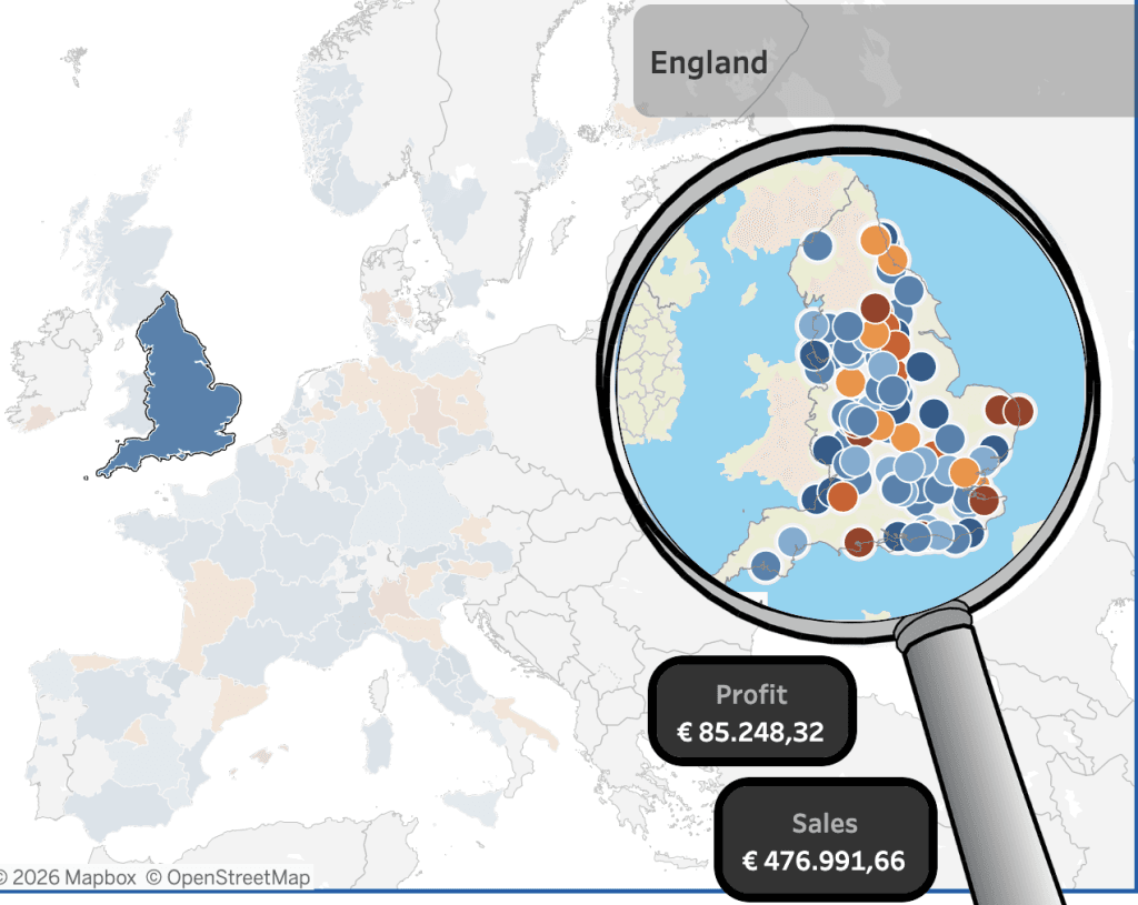
Dashboards like this highlight the creative possibilities within Tableau and demonstrate how effective design can turn complex data into something intuitive and engaging. If you’re looking for inspiration for your
