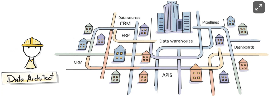
What Is a Data Architect (Really)?
Baraa Khatib Salkini reframes data architecture not as an advanced technical badge, but as a craft of design thinking. It dives into the questions great architects ask – about consistency,…
Baraa Khatib Salkini reframes data architecture not as an advanced technical badge, but as a craft of design thinking. It dives into the questions great architects ask – about consistency,…
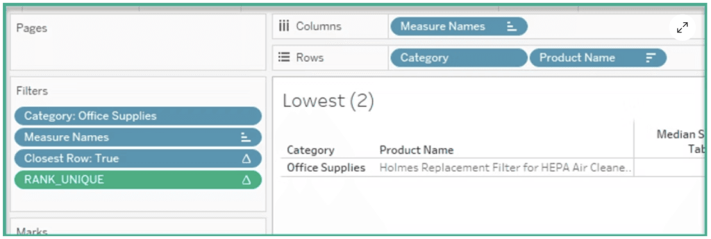
Dawn Harrington’s tutorial bridges theory and practice: it doesn’t just tell you what to do, it shows why those calculations work, and when you might need to tweak them (for
What are the Highest, Lowest and Median Products? Read More »
Samad Husain’s article gives recognition where it’s due: to the data engineers who catch formatting inconsistencies, anticipate edge cases, clean “dirty” inputs, and glue together complex systems. It also helps
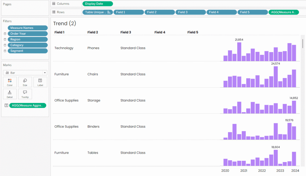
Beyond the mechanics, Ken Flerlage’s post gives you a mindset shift. Instead of “Let everyone build whatever they want (and hope nothing breaks),” it shows how you can offer controlled
How to Create Customisable Table & Chart Builders Read More »
Whether you’re a data analyst, a BI developer, or just someone who deals with spreadsheets regularly, Robin Jones‘ explanations make these common operations less scary and more methodical. If you
This isn’t just a critique, it also prompts you to rethink your own design habits. Jonathan Schwabish’s piece doesn’t demand a rigid “rule,” but suggests better practices, questions assumptions, and
When Time Gets Flipped: Rethinking Bar Chart Order Read More »
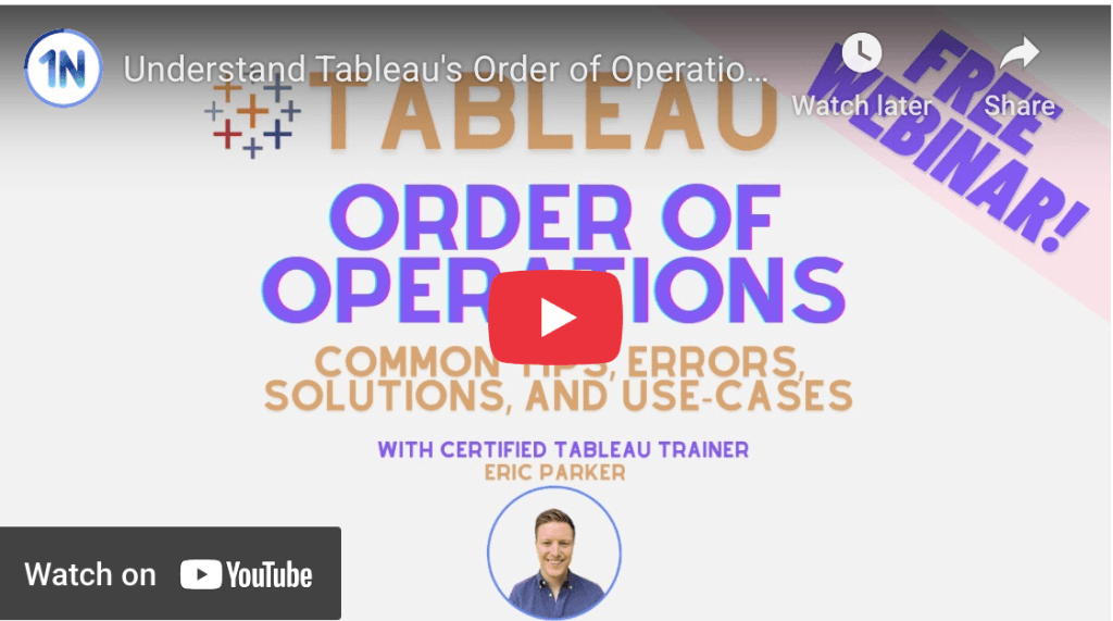
You’ll see real examples, tips that come from experience (like how to avoid missing data or misapplied filters), and guidance on how to think more deliberately as you build your
Tableau Order of Operations – Common Tips, Errors, Solutions and Use Cases Read More »
What makes Shaun Davis‘ post particularly worth your time, is its pragmatic balance: strategy and execution. Instead of vague “big‑picture” platitudes, you’ll see what kind of steps leaders have taken
From Vision to Victory: Executing Your Data Leadership Plan Read More »
Joss Lazenby breaks down the logic step by step – using functions like CONTAINS and LOWER to make the search case-insensitive, and then wiring it together with filter actions so
What makes Jennifer Dawes series exciting is the invitation to watch an idea grow in public. Instead of a final polished product, you’re seeing the process: where things don’t quite
