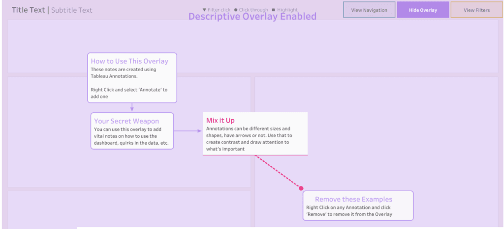
The Easiest Instructional Overlay Ever
What’s even better: Kevin Flerlage’s post includes a short video and a template you can click through to try the overlay in action. Whether you just started building dashboards or…
What’s even better: Kevin Flerlage’s post includes a short video and a template you can click through to try the overlay in action. Whether you just started building dashboards or…

The first method, using simple shapes and tooltips – it’s great way to start embedding instructions without overwhelming users. It’s clean, intuitive, and easy to implement. The second method, by
What makes this post most useful, is the emphasis on action over insight. Shaun Davis doesn’t stop at self‑reflection, he beckons you to do something with your discoveries. He encourages
Nate Nichols‘ article doesn’t leave you floating in theory. It explains what modern semantic layers look like, how roles are changing (analysts becoming curators or coaches of models), and what
Your Semantic Data Model is the Secret to Trusted Agentic Analytics Read More »
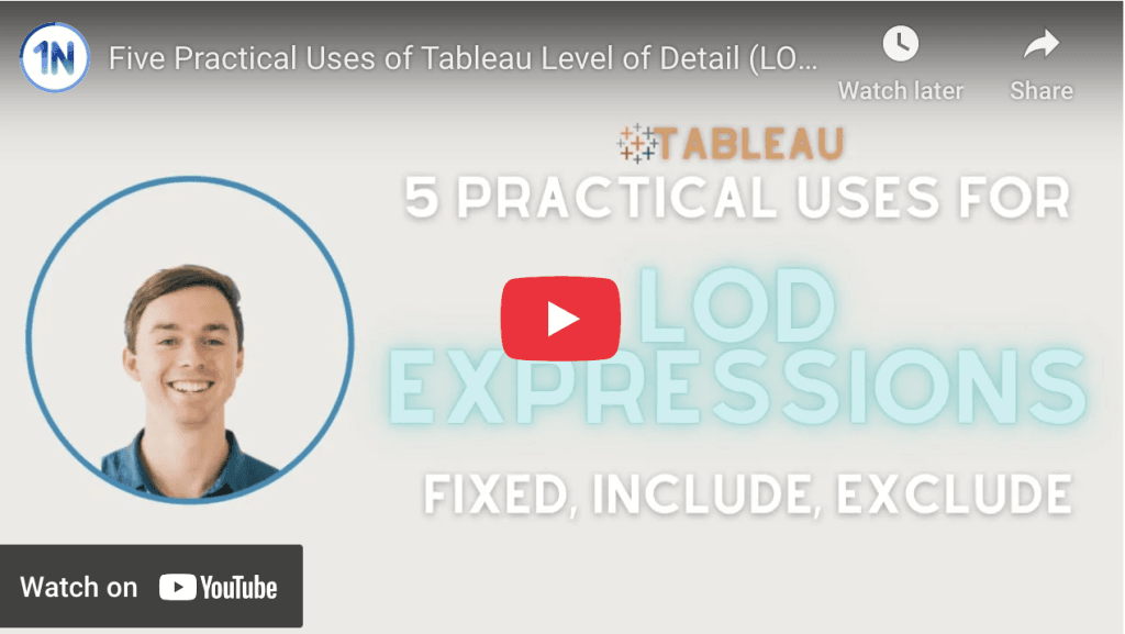
Seeing LODs used in context can make all the difference. In Ollie Linley’s YouTube video, you’ll explore the three main types: FIXED, INCLUDE, and EXCLUDE. While FIXED is often the
Beyond the technical tweaks, Jennifer Dawes‘ post is about rediscovery. Of joy, of consistency, of intimacy with ideas. You’ll find not only tips (like connecting multiple digital libraries or tagging
Dawn Harrington’s article will save you time and stress. Rather than explaining every calculation in endless meetings or worrying over auditability, you can confidently hand over structured documentation. Whether you’re
Do you need a list of the Tableau Calculations for your clients? Read More »
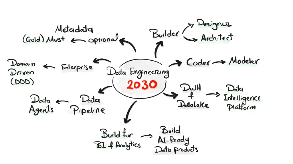
This article doesn’t stop at speculation. Baraa Khatib Salkini gives concrete pointers: how to shift your mindset from builder to architect; why modelling and metadata are becoming (or will become)
The Future of Data Engineering: From Builders to Architects Read More »

Joe Hughes‘ reflections are rich with context and honest about trade‑offs: when to stand firm, when to pivot, and how to keep a team’s energy high under pressure. Whether mentoring
The 5 Dos (and a Few Don’ts) of Project Management Read More »
But the value here goes beyond just the tip itself – it shows the ripple effect of community and mentorship. Umar Hassan is part of the Tableau Sandbox Buddy program,
