Elements of a Well-Designed Dashboard
Shaun Davis dives into the key elements of an effective dashboard, helping you create visuals that truly serve their purpose. From choosing the right charts to organising information for maximum…
Ewald Hofman and Wilson Po highlights how free extensions can add powerful new features to your dashboards. Whether you want to incorporate advanced filtering, animations, or new ways to explore
Enhance Your Tableau Public Storytelling With Free Extensions Read More »
Selecting the right chart for your data is crucial for clear and effective communication, and this guide from Chart Guide is the perfect resource to help you make the best
Elevate your dashboards with minimal effort – Ann Pregler introduces 12 tiny but powerful upgrades that can make a huge impact on the clarity, usability, and overall aesthetics of your
If you’re looking to make your Tableau dashboards look more polished while saving time, Stephanie Shorey-Roca’s article shares six easy formatting tips that will help you clean up your visuals,
Six Easy Tableau Formatting Tips to Save You Time Read More »
If you’ve ever felt that data analytics is too complex or intimidating, this article by Larissa Amoroso explores how a data leader (Darrick Bartley) is making analytics more approachable and
How One Data Leader Makes Analytics Less Intimidating and More Actionable Read More »
Shaun Davis‘ post explores why so many dashboards fail to communicate insights effectively and what can be done to fix them. Instead of relying on complex visuals that require endless
The Pareto principle (80/20 rule) can transform even the simplest charts into powerful decision-making tools. By applying this method, you can quickly identify key drivers of impact in your data,
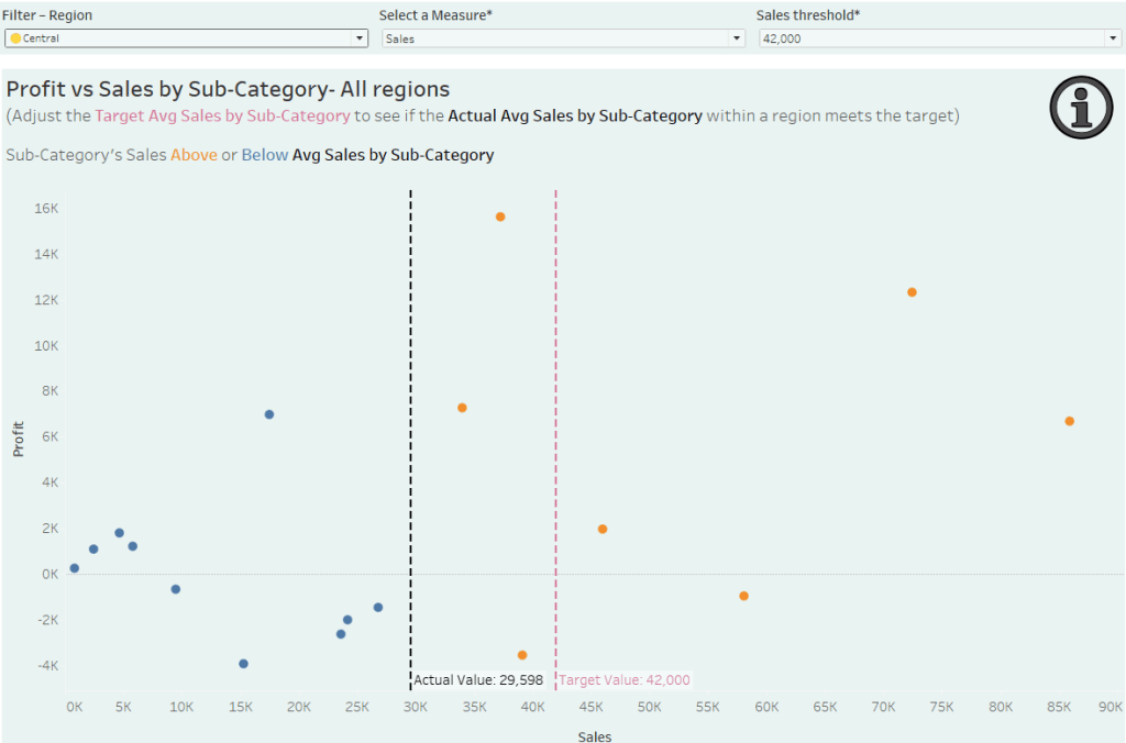
Unlock the full potential of scatter plots in Tableau with Marcus Oberdiek. He walks us through the process of making your scatter plots interactive and insightful. Instead of static visuals,
Interactive Scatter Plots in Tableau: Explore Data with Drilldowns and Tooltips Read More »
Have you ever wished your Tableau dashboards could offer instant guidance or extra context without overwhelming the design? Alfie King’s post dives into the art of creating information buttons in