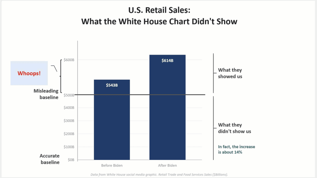
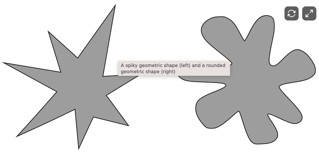
My Data Journey
Dive into the fascinating world of data leadership with Karthik Palanivel‘s journey. He shares his unique experiences and insights -illustrating the pivotal moments that shaped his career in data. From…
Level up your Tableau expertise with Kevin Flerlage and this treasure trove of invaluable insights. He dives into practical tips and creative techniques that can transform how you approach data
If you’re eager to elevate your Tableau dashboards with unique and interactive elements, Brittany Rosenau‘s article is an essential read. Her guide teaches you how to design an eye-catching dashboard
Create a dashboard overlay — ENTIRELY in Tableau Read More »
Jim Dehner’s post introduces Tableau’s Viz Extensions in a way that’s accessible to users of all levels – showing how these add-ons can supercharge your visualisations. From enhancing interactivity to
Dive into this post with Dawn Harrington (TechTipsGirl) as she talks us through this often-overlooked topic. She offers practical advice on how to enhance your dashboards by allowing users to
This guide by Felicia Styer and Juan Carlos Guzman is the perfect place to start. Their tutorial dives into how you can give your users the ability to make multiple
If you’re eager to take your data visualisation skills to the next level, this post, by Andy Kriebel is an excellent resource to explore. It delves into the concept of
This article covers various techniques to manage large and complex data sources efficiently – helping you streamline your analysis and create more impactful visualisations. By applying the insights shared in
Boost Your Tableau Workbooks With Large and Complex Data Sources Read More »
Here, Jennifer Dawes explores the essential role that feedback plays in the visualisation process – emphasising how constructive criticism can help you refine your work and make it more impactful.
The Art of Feedback in Data Visualization: What Works and What Doesn’t Read More »
This piece, by Thomas Nahn and Lari McEdward, delves into the intricacies of working with multi-fact relationships, which can significantly enhance your data visualisations by allowing you to analyse multiple
When and How to Use Multi-fact Relationships in Tableau Read More »