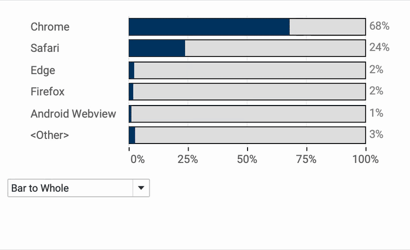
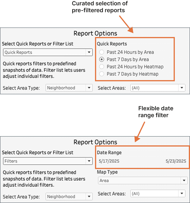
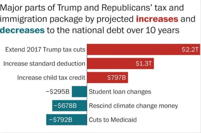
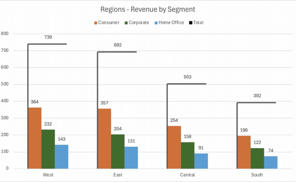
Visualising Ranges
Effectively visualising data ranges is essential for communicating variability and trends in your analysis. Donna Coles provides expert insights on how to do it right. Whether you’re working with financial…
Whether you’re building mobile-friendly dashboards, working with intricate datasets, or simply aiming for a cleaner interface, Johan de Groot’s tips will help you strike the perfect balance between usability and
This insightful article, with CJ Mayes and Matt Antoline explores how to create stunning isometric charts, adding a 3D-like perspective that enhances data storytelling without compromising clarity. Step beyond traditional
Creating dynamic and interactive dashboards is key to keeping users engaged, and Dan Booth shows you exactly how to do that – allowing users to seamlessly switch between datasets or
Tableau administrators play a crucial role in ensuring that dashboards run smoothly, efficiently, and securely. Ken Flerlage’s article is an essential read for anyone managing a Tableau environment – uncovering
Tables are a fundamental part of data visualisation, but they don’t have to be dull! For anyone looking to transform basic tables into visually stunning and highly functional data displays,
How to Create Fancy Tables from a Guest Blogger! Read More »
If you’ve ever faced performance issues or unexpected data duplication in Tableau, Cartesian joins might be the culprit. Jim Dehner walks through common issues (including unnecessary row multiplication and slow
Tableau’s layering feature introduced in version 2020.4 is a game-changer for creating richer, more dynamic visualisations. Adam McCann walks you through how to stack multiple data elements within a single
Dynamic dashboards are the future of data visualisation and Donna Coles post shares an exciting way to enhance user experience. Instead of using filters just to refine data, she dives
A well-designed dashboard is only as effective as its documentation. Without clear guidance, users may struggle to interpret key metrics, understand filters, or navigate functionalities – reducing the impact of