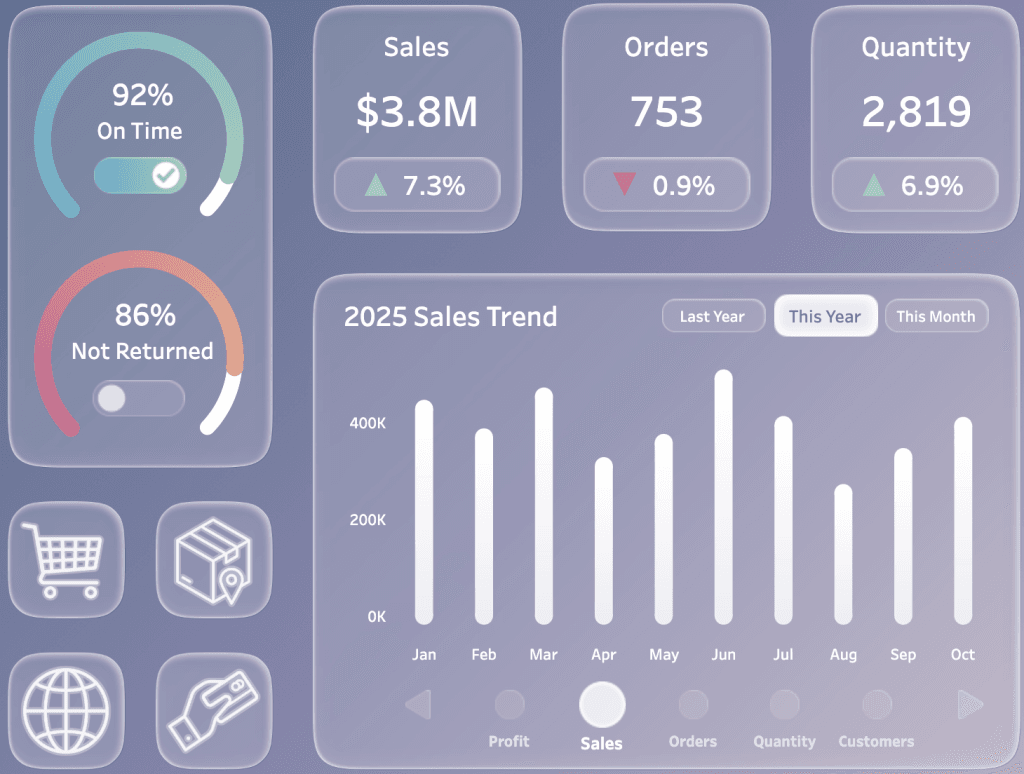
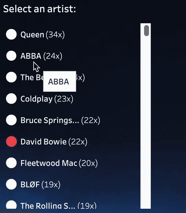
Comparing Categories Based on Rank in Tableau
Beyond the immediate technical how-to, Joseph Hughes‘ post is a great reminder of how small tweaks can make big differences in how users can interact with their dashboards. Learn how…
Beyond the mechanics of chart types, Cole Nussbaumer Knaflic invites you to step back and ask: What does my data story need to show? Are you comparing categories at one
This gives you more than design tricks, it gives you a mindset shift. You’ll begin to ask: “What is the one thing I want my audience to walk away with?”
Beyond the technical call-outs, Dan Chissick offers practical advice for when you should pick “tabs” vs “no tabs”, walking you through navigation and performance impacts too. Spoiler: performance isn’t impacted
Eric Balash kicks things off in Week 1 with one of the most underrated aspects of dashboard design: designing to a grid. A solid grid brings order and clarity –
Dashboard Design Lab: Week 1 – Designing to a Grid Read More »
This Tableau article doesn’t just dwell on ‘cool features’, it talks deeply about trust, security and how these AI capabilities are grounded in real‑world data governance through what they call
Why Most ‘AI in BI’ Is Just a Gimmick and How Tableau’s Approach to AI is Different Read More »
Anastasiya Kuznetsova doesn’t just describe the framework, she shows how you might apply it in real‑world design, product and research workflows – offering fresh insight and practical guidance. If you
Jobs-to-be-Done: A User-Centered Approach to Dashboard Design Read More »
What’s great about Tore Levinsen’s post is the emphasis on reusability and clarity: including descriptions for each change step, and showing how you can copy/paste steps in your flow to
Annabelle Rincon combines storytelling with something tangible: you’ll see how data visualisation doesn’t always need to be about quarterly reports or KPIs, it can also be about engaging, unexpected interaction.
Joss Lazenby’s post balances creative design with practical how-to guidance. You’ll not only learn why using transparency can enhance readability and highlight what matters, but also how to add a
Tableau Tips: Adding and Utilising a Transparent Colour Palette Read More »